In the initial stage of exploratory data analysis, measures of location and measures of variability are studied to identify, respectively, the central tendency of a variable and how widely its observations spread around that central value. However, a thorough statistical description extends beyond these two dimensions. Two distributions can share nearly identical means and standard deviations yet differ substantially in their overall structure. Therefore, evaluating distribution shape is essential.
Measures of shape characterize attributes such as skewness and probability mass concentration around the center or in the tails, commonly captured by kurtosis. Practically, these metrics answer questions like: do most products yield moderate sales while a few generate exceptionally high revenue?, are observations symmetrically distributed?, do heavy tails or frequent extreme values emerge?, can a transformation enhance visual and statistical interpretation? Furthermore, shape metrics guide subsequent EDA steps, such as outlier review, robust measure selection, or variable transformations.
In this chapter, we evaluate measures of shape within the BigMart dataset, focusing primarily on Item_Outlet_Sales. Nevertheless, the techniques presented apply to other numerical variables as well, such as Item_MRP, Item_Visibility, and Item_Weight.
Environment Setup
We will work with the following BigMart dataset. For this section, we will use Python along with pandas, numpy, plotly, and matplotlib.
import numpy as npimport pandas as pdimport matplotlib.pyplot as pltimport plotly.express as pximport plotly.graph_objects as gofrom scipy import statsplt.rcParams["figure.figsize"] = (8, 5)plt.rcParams["axes.grid"] =TrueDATA_PATH ="../../data/bigmart_sales.csv"df = pd.read_csv(DATA_PATH)df.head()
Item_Identifier
Item_Weight
Item_Fat_Content
Item_Visibility
Item_Type
Item_MRP
Outlet_Identifier
Outlet_Establishment_Year
Outlet_Size
Outlet_Location_Type
Outlet_Type
Item_Outlet_Sales
0
FDA15
9.30
Low Fat
0.016047
Dairy
249.8092
OUT049
1999
Medium
Tier 1
Supermarket Type1
3735.1380
1
DRC01
5.92
Regular
0.019278
Soft Drinks
48.2692
OUT018
2009
Medium
Tier 3
Supermarket Type2
443.4228
2
FDN15
17.50
Low Fat
0.016760
Meat
141.6180
OUT049
1999
Medium
Tier 1
Supermarket Type1
2097.2700
3
FDX07
19.20
Regular
0.000000
Fruits and Vegetables
182.0950
OUT010
1998
NaN
Tier 3
Grocery Store
732.3800
4
NCD19
8.93
Low Fat
0.000000
Household
53.8614
OUT013
1987
High
Tier 3
Supermarket Type1
994.7052
Before proceeding, it is good practice to check variable types and focus on quantitative columns.
When \(g_1 > 0\), the right tail extends further; when \(g_1 < 0\), the left tail dominates; and when \(g_1 \approx 0\), the distribution is approximately symmetric, though visual inspection should always confirm this.
Kurtosis
Kurtosis summarizes the relative weight of the tails and mass concentration around the center. A standard sample excess kurtosis formulation is:
count     8523.000000
mean      2181.288914
std       1706.499616
min         33.290000
25%        834.247400
50%       1794.331000
75%       3101.296400
max      13086.964800
Name: Item_Outlet_Sales, dtype: float64
fig = px.histogram( df, x="Item_Outlet_Sales", nbins=50, marginal="box", title="Distribution of Item_Outlet_Sales")fig.update_layout(bargap=0.05)fig.show()
From the histogram and boxplot, several key distribution shape properties become clear.
First, visual symmetry is absent. The distribution displays marked positive skewness (right skew): the vast majority of observations concentrate at lower sales values, while a long tail stretches toward higher revenue levels.
Second, long right tails are evident. This indicates that while most product-store combinations produce moderate revenue, a subset achieves significantly higher sales volumes.
Third, potential outliers exist, as confirmed by the boxplot where numerous observations appear beyond the upper whisker boundary.
Finally, the bulk of data mass concentrates within a bounded low-to-mid range, while a small fraction achieves extreme sales figures. This shows that typical business performance is driven by moderate sales, supplemented by standout high-performing items or store locations.
Overlaying an estimated kernel density curve further clarifies this structure.
import numpy as npimport plotly.graph_objects as gofrom scipy import statsxs = np.linspace(sales.min(), sales.max(), 400)kde = stats.gaussian_kde(sales)fig = go.Figure()# Histogram (density scale)fig.add_trace( go.Histogram( x=sales, nbinsx=40, histnorm="probability density", opacity=0.6, name="Histogram" ))# KDE curvefig.add_trace( go.Scatter( x=xs, y=kde(xs), mode="lines", name="Estimated Density", line=dict(width=2) ))fig.update_layout( title="Histogram and Estimated Density of Item_Outlet_Sales", xaxis_title="Item_Outlet_Sales", yaxis_title="Density", bargap=0.02, height=500, width=900)fig.show()
Overlaying the histogram with a KDE curve provides a smooth visual representation of overall distribution shape, highlighting central concentration, right skewness, and tail extension.
While not rigid rules, these guidelines aid initial data appraisal. Commercial datasets frequently exhibit positive skewness: many items yield moderate sales while a select few generate high revenue.
Shape Comparison Across Numerical Variables
Distribution shape varies across attributes. We now evaluate skewness and excess kurtosis across all numerical columns.
shape_table = pd.DataFrame({"variable": num_cols,"skewness": [df[c].dropna().skew() for c in num_cols],"excess_kurtosis": [df[c].dropna().kurt() for c in num_cols]}).sort_values("skewness", key=np.abs, ascending=False)shape_table
Comparing skewness and excess kurtosis shows that numerical variables feature distinct structural shapes. Specifically, Item_Outlet_Sales exhibits positive skewness of 1.177531 and excess kurtosis of 1.615877, while Item_Visibility displays skewness of 1.167091 and excess kurtosis of 1.679445. These metrics reflect long right tails and extreme value vulnerability, suggesting that robust statistics, boxplots, and log transformations are appropriate for analyzing both attributes.
In contrast, Item_MRP shows near-symmetric skewness (0.127202) and negative excess kurtosis (-0.889769), while Item_Weight displays skewness of 0.082426 and excess kurtosis of -1.227766. This indicates that both features conform closely to symmetric, lighter-tailed distributions.
Meanwhile, Outlet_Establishment_Year registers negative skewness of -0.396641 and excess kurtosis of -1.205694. Given its discrete temporal nature, interpretation should account for establishment milestones rather than continuous density assumptions.
Overall, these findings reinforce that EDA techniques must adapt to each variable’s unique shape rather than applying uniform descriptive assumptions.
Transformations and Their Effect on Shape
When a feature exhibits pronounced positive skewness, a logarithmic transformation can stabilize variance and improve visualization and modeling. A standard formulation for sales is:
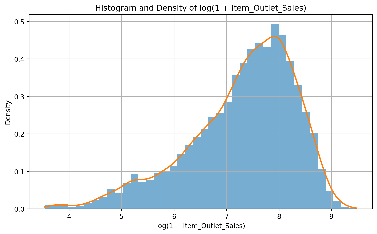
plt.figure()plt.hist(log_sales, bins=40, density=True, alpha=0.6)xs_log = np.linspace(log_sales.min(), log_sales.max(), 400)kde_log = stats.gaussian_kde(log_sales)plt.plot(xs_log, kde_log(xs_log), linewidth=2)plt.title("Histogram and Density of log(1 + Item_Outlet_Sales)")plt.xlabel("log(1 + Item_Outlet_Sales)")plt.ylabel("Density")plt.tight_layout()plt.show()
Comparing the original feature against its log-transformed version demonstrates a key EDA principle: shape measures guide practical data engineering decisions. When skewness drops substantially under transformation, the underlying phenomenon gains a far more balanced representation.
Specifically, log transformations compress large values relative to small values, pulling long right tails inward and centering the distribution mass.
In EDA, log transformations aid by:
enhancing visual distribution inspection, preventing extreme high values from crushing histogram detail;
facilitating relative comparisons, as log-scale differences correspond to proportional percentage shifts;
mitigating outlier dominance, clarifying core data patterns.
Furthermore, log-transformed features benefit downstream predictive modeling, particularly linear models or algorithms sensitive to skewed inputs and heteroscedasticity.
Quantile-Quantile (Q-Q) Plots as Visual Guides
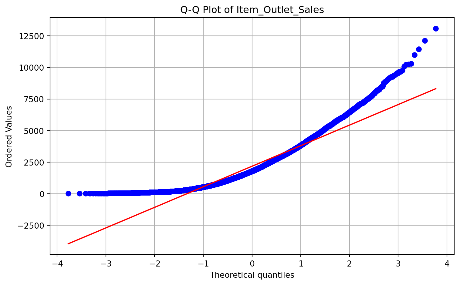
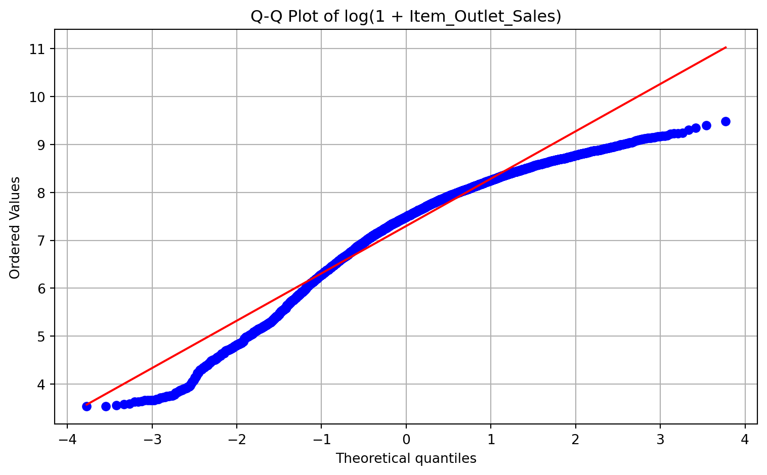
Q-Q plots compare sample quantiles against theoretical normal distribution quantiles. While not a formal hypothesis test, Q-Q plots offer an intuitive visual diagnostic for normal distribution deviations and tail behavior.
plt.figure()stats.probplot(sales, dist="norm", plot=plt)plt.title("Q-Q Plot of Item_Outlet_Sales")plt.tight_layout()plt.show()
plt.figure()stats.probplot(log_sales, dist="norm", plot=plt)plt.title("Q-Q Plot of log(1 + Item_Outlet_Sales)")plt.tight_layout()plt.show()
If the log-transformed variable aligns far more closely with the reference line than the raw variable, we obtain visual confirmation of shape regularization.
Shape Mini-Dashboard
The following section builds a compact dashboard summarizing sales shape metrics before and after log transformation.