Classifier Evaluation: Essential Metrics and Their Interpretation
Author
Diego Villalba
Published
October 16, 2026
Introduction
The evaluation of classification models constitutes one of the most strategically complex problems in Data Mining. It is not enough to build a model that “works”: it is necessary to quantify precisely and contextually how well it works, in which scenarios it fails, and what types of errors it makes, since as we will see below, classifier quality is completely determined by the model’s objective and application context (Han et al. 2011).
This distinction carries direct consequences in real-world environments: a medical diagnostic model that confuses “statistical accuracy” with “clinical utility” may leave sick patients untreated; a fraud detection system optimizing the wrong metric may block legitimate transactions and damage customer relations.
Consequently, specialized literature has produced a robust set of metrics and evaluation tools extending far beyond intuitive accuracy percentages. Understanding these metrics is a core competency of the data scientist (Provost and Fawcett 2013).
This chapter systematically develops the most important metrics for evaluating binary and multiclass classifiers, integrating them with the KDD (Knowledge Discovery in Databases) process and decision-making logic in high-stakes contexts. Each section combines mathematical rigor with executable Python code, following the principle that deep understanding of a metric requires formal derivation as well as implementation and visualization on real data.
Errors
In this chapter we define an error as a situation where a classification model assigns an incorrect label to an instance.
We define the error rate as the proportion of incorrectly classified instances over total evaluated instances.
Definition. The error rate of a classifier with \(k\) errors on a test set of \(n\) instances is defined as:
\[
\epsilon = \frac{k}{n}
\tag{1}\]
At first glance, this definition may seem sufficient for evaluating any classifier, given that in most cases the objective is minimizing the total number of errors committed by the model. However, as we will explore throughout this chapter, not all errors are created equal; depending on context, different mistakes carry radically different consequences.
Error Types and Their Costs
The Confusion Matrix: The Foundation of All Classifier Evaluation
Generally speaking, we designate a class as positive (1) when it represents the target class of interest, and negative (0) when it is the complementary class. For instance, in a fraud detection system, the positive class is “fraud” and the negative class is “legitimate transaction”. In a medical diagnostic system, the positive class is “sick” and the negative class is “healthy”.
We can organize the errors of a binary classifier using the confusion matrix, a tabular representation that synthesizes binary classifier performance (Han et al. 2011). Formally, it is defined as:
Definition. For a classifier with positive (1) and negative (0) classes, the confusion matrix is defined as:
where rows represent actual ground-truth classes and columns represent predicted classes. The four components are:
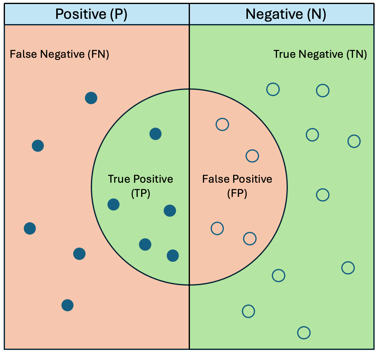
TP (True Positive): Model predicted positive and actual instance is positive. Correct classification of the target class.
TN (True Negative): Model predicted negative and actual instance is negative. Correct classification of the majority/normal class.
FP (False Positive): Model predicted positive but actual instance is negative. Also called Type I Error.
FN (False Negative): Model predicted negative but actual instance is positive. Also called Type II Error.
Visually, the error types can be represented in the following diagram:
Visual representation of a confusion matrix and binary classification metrics. The diagram illustrates the relationship between actual ground truth (Positive/Negative columns) and model predictions (central circle). True Positives (TP) and False Positives (FP) fall within the prediction area, while False Negatives (FN) and True Negatives (TN) lie in the exclusion area.
As detailed below, the confusion matrix forms the bedrock of classifier evaluation, as all performance metrics are derived from it. Furthermore, interpreting each element carries direct strategic implications for model-driven decision making.
Synthetic Datasets Generation
Throughout this chapter, two synthetic datasets replicating the statistical characteristics of real-world problems are used.
The Medical Dataset simulates detecting a severe medical condition with ~8% prevalence, reflecting typical class imbalance in screening studies.
The Financial Dataset simulates transactions with a ~3% fraud rate, matching industry benchmarks (Pedregosa et al., 2011).
Both datasets are generated using sklearn.datasets.make_classification, controlling the number of informative features, label noise, and class imbalance.
Show code
# ── Global Setup and Imports ───────────────────────────────────────────────import numpy as npimport pandas as pdimport plotly.graph_objects as goimport plotly.figure_factory as fffrom plotly.subplots import make_subplotsfrom sklearn.datasets import make_classificationfrom sklearn.linear_model import LogisticRegressionfrom sklearn.ensemble import RandomForestClassifierfrom sklearn.model_selection import train_test_splitfrom sklearn.metrics import ( confusion_matrix, accuracy_score, precision_score, recall_score, f1_score, fbeta_score, roc_curve, auc, precision_recall_curve, average_precision_score, classification_report,)SEED =42# ── Medical Dataset: 92% healthy, 8% sick ──────────────────────────────────X_med, y_med = make_classification( n_samples=1000, n_features=10, n_informative=5, weights=[0.92, 0.08], # strong imbalance flip_y=0.02, # 2% label noise random_state=SEED,)X_tr_m, X_te_m, y_tr_m, y_te_m = train_test_split( X_med, y_med, test_size=0.3, stratify=y_med, random_state=SEED)# ── Financial Dataset: 97% legitimate, 3% fraud ────────────────────────────X_fin, y_fin = make_classification( n_samples=5000, n_features=15, n_informative=7, weights=[0.97, 0.03], flip_y=0.01, random_state=SEED,)X_tr_f, X_te_f, y_tr_f, y_te_f = train_test_split( X_fin, y_fin, test_size=0.3, stratify=y_fin, random_state=SEED)# ── Model 1: Logistic Regression — Medical dataset ────────────────────────modelo_lr = LogisticRegression(random_state=SEED, max_iter=500)modelo_lr.fit(X_tr_m, y_tr_m)y_pred_lr = modelo_lr.predict(X_te_m)y_prob_lr = modelo_lr.predict_proba(X_te_m)[:, 1]# ── Model 2: Random Forest — Medical dataset ──────────────────────────────modelo_rf = RandomForestClassifier(n_estimators=100, random_state=SEED)modelo_rf.fit(X_tr_m, y_tr_m)y_pred_rf = modelo_rf.predict(X_te_m)y_prob_rf = modelo_rf.predict_proba(X_te_m)[:, 1]# ── Model 3: Logistic Regression — Financial dataset ──────────────────────modelo_fin = LogisticRegression( random_state=SEED, max_iter=500, class_weight="balanced")modelo_fin.fit(X_tr_f, y_tr_f)y_pred_fin = modelo_fin.predict(X_te_f)y_prob_fin = modelo_fin.predict_proba(X_te_f)[:, 1]print("Class distribution — Medical test set :",dict(zip(*np.unique(y_te_m, return_counts=True))))print("Class distribution — Financial test set :",dict(zip(*np.unique(y_te_f, return_counts=True))))
Class distribution — Medical test set    : {np.int64(0): np.int64(275), np.int64(1): np.int64(25)}
Class distribution — Financial test set  : {np.int64(0): np.int64(1449), np.int64(1): np.int64(51)}
To evaluate models throughout the chapter, we fit three binary classifiers: Logistic Regression and Random Forest on the medical dataset, and a class-weighted Logistic Regression on the financial dataset.
Below is the confusion matrix for the Logistic Regression model on the medical dataset:
From this confusion matrix, all subsequent performance metrics are derived. Furthermore, interpreting each cell carries direct strategic consequences.
Asymmetric Cost of Errors: Real-World Contexts
The single most important characteristic of classification errors is not their raw frequency, but their differential cost. In almost all real data mining applications, FP and FN do not carry equal costs; optimizing for one inevitably trades off against the other (James et al., 2021).
Healthcare: The Devastating Cost of False Negatives
In a lung cancer screening system, a False Negative means predicting “benign” for a malignant nodule. The patient leaves untreated. This asymmetry means clinical screening prioritizes high Recall (low FN rate), even at the expense of lower Precision. A False Positive means predicting “malignant” for a benign nodule: the patient undergoes an unnecessary biopsy —an invasive and costly procedure— but compared to missing cancer, an FP is the tolerable error.
Finance: The Operational Cost of False Positives
In fraud detection, a False Positive blocks a legitimate credit card transaction: the customer cannot complete their purchase, risking customer attrition. A False Negative allows fraudulent transactions to pass, but the monetary loss is typically insured or subject to chargebacks. This inverse asymmetry means fraud systems prioritize high Precision, accepting that some frauds slip through undetected (Provost & Fawcett, 2013).
Properly evaluating a classifier requires analyzing not just the total number of errors, but their type and cost. A suite of metrics derived from the confusion matrix quantifies different facets of model performance. These metrics are complementary rather than mutually exclusive, and should be evaluated jointly. Below are the primary metrics for binary classification, complete with formal definitions, calculations, and contextual interpretations.
The most severe flaw of accuracy emerges under class imbalance, an extremely prevalent scenario in real-world data mining (Saito & Rehmsmeier, 2015). In our financial dataset with 97% legitimate transactions, a dummy classifier predicting “legitimate” for all transactions achieves ~97% accuracy while detecting zero fraud:
Show code
# ── Accuracy Paradox — Financial Dataset ───────────────────────────────────y_trivial_fin = np.zeros_like(y_te_f)acc_trivial_fin = accuracy_score(y_te_f, y_trivial_fin)acc_modelo_fin = accuracy_score(y_te_f, y_pred_fin)recall_trivial = recall_score(y_te_f, y_trivial_fin, zero_division=0)recall_modelo = recall_score(y_te_f, y_pred_fin)print("Financial Dataset (97% legitimate, 3% fraud)")print("─"*52)print(f"Accuracy — Trivial Model : {acc_trivial_fin:.4f} ({acc_trivial_fin*100:.1f} %)")print(f"Accuracy — Real Model : {acc_modelo_fin:.4f} ({acc_modelo_fin*100:.1f} %)")print()print(f"Recall — Trivial Model : {recall_trivial:.4f} → 0 frauds detected")print(f"Recall — Real Model : {recall_modelo:.4f} → detects real frauds")print()print("Takeaway: higher accuracy ≠ better model on imbalanced data.")print("(Saito & Rehmsmeier, 2015)")
Financial Dataset (97% legitimate, 3% fraud)
────────────────────────────────────────────────────
Accuracy — Trivial Model : 0.9660  (96.6 %)
Accuracy — Real Model    : 0.7820  (78.2 %)

Recall   — Trivial Model : 0.0000  → 0 frauds detected
Recall   — Real Model    : 0.7255  → detects real frauds

Takeaway: higher accuracy ≠ better model on imbalanced data.
(Saito & Rehmsmeier, 2015)
Show code
# ── Visualization: Accuracy vs. Recall ─────────────────────────────────────modelos = ["Real Model\n(LR + class_weight)", "Trivial Model\n(always negative)"]accuracies = [acc_modelo_fin, acc_trivial_fin]recalls = [recall_modelo, recall_trivial]fig = go.Figure(data=[ go.Bar(name="Accuracy", x=modelos, y=accuracies, marker_color=["#4a90d9", "#e74c3c"], text=[f"{v:.2%}"for v in accuracies], textposition="auto"), go.Bar(name="Recall (fraud class)", x=modelos, y=recalls, marker_color=["#27ae60", "#c0392b"], text=[f"{v:.2%}"for v in recalls], textposition="auto"),])fig.update_layout( barmode="group", title=("Accuracy Paradox in Financial Dataset<br>""<sup>Saito & Rehmsmeier (2015): higher accuracy model detects 0 frauds</sup>" ), yaxis=dict(title="Value", range=[0, 1.1], tickformat="%"), height=420,)fig.show()
Precision: Reliability of Positive Predictions
Formal Definition
\[
\text{Precision} = \frac{TP}{TP + FP}
\]
Precision measures the proportion of positive predictions that are truly positive (James et al., 2021).
Detailed Calculation
Show code
# ── Precision: Manual Calculation and sklearn ──────────────────────────────precision_manual = TP / (TP + FP) if (TP + FP) >0else0precision_sk = precision_score(y_te_m, y_pred_lr, zero_division=0)print(f"Manual Calculation — Precision = {TP} / ({TP}+{FP}) = {precision_manual:.4f}")print(f"sklearn — Precision = {precision_sk:.4f}")print()print(f"Interpretation: for every 10 'sick' alerts,")print(f" approximately {precision_sk*10:.1f} correspond to truly sick patients.")
Manual Calculation — Precision = 6 / (6+2) = 0.7500
sklearn            — Precision = 0.7500

Interpretation: for every 10 'sick' alerts,
  approximately 7.5 correspond to truly sick patients.
Limitation: High Precision \(\neq\) Good Classifier
Precision measures prediction quality. A system that is ultra-conservative and only triggers alerts under absolute certainty achieves perfect Precision (1.0): every alert issued is correct. However, the price of perfection is silence: the system ignores many actual positive cases out of caution.
Conversely, if a system alerts indiscriminately, its Precision drops. Fawcett (2006) notes that extremely low precision causes alarm fatigue: users receive so many false alarms that they lose trust and ignore the system entirely.
Example: Spam Filtering
High Precision (Conservative): The spam filter only flags messages containing “100% FREE GUARANTEED CASH”. Precision is 1.0 (no important emails sent to spam), but the inbox fills with uncaught spam.
Low Precision (Alarm Fatigue): The filter flags any email containing exclamation marks or capital letters. It catches all spam, but sends legitimate invoices to spam as well. Users end up checking the spam folder daily, defeating the filter’s purpose.
Recall measures the proportion of actual positive cases successfully identified by the classifier (Fawcett, 2006).
Calculation and Relationship to False Negative Rate
Show code
# ── Recall Calculation and FNR Relationship ────────────────────────────────recall_manual = TP / (TP + FN) if (TP + FN) >0else0recall_sk = recall_score(y_te_m, y_pred_lr)fnr = FN / (TP + FN) # False Negative Rate = 1 − Recallprint(f"Manual Calculation — Recall = {TP} / ({TP}+{FN}) = {recall_manual:.4f}")print(f"sklearn — Recall = {recall_sk:.4f}")print(f"FNR (1 − Recall) = {fnr:.4f}")print()print(f"Out of {y_te_m.sum()} actual sick patients in the test set,")print(f" the model detects {TP} and misses {FN}.")
Manual Calculation — Recall = 6 / (6+19) = 0.2400
sklearn            — Recall = 0.2400
FNR (1 − Recall)            = 0.7600

Out of 25 actual sick patients in the test set,
  the model detects 6 and misses 19.
Limitation: High Recall \(\neq\) Good Classifier
While Precision focuses on alert quality, Recall focuses on coverage: how effectively the system catches all true positive cases.
A system with Recall = 1.0 catches 100% of target cases. However, achieving perfect recall often requires predicting positive aggressively, dragging along numerous False Positives and degrading Precision.
Example: Smoke Alarm
High Recall (Total Sensitivity): A smoke alarm triggers at the slightest hint of water vapor or toast. Recall is 1.0 (no real fire goes undetected), but occupants suffer constant false alarms (low precision).
Low Recall (Strict Threshold): A smoke detector only activates when flames directly touch the sensor. Precision is high (if it sounds, there is a fire), but Recall is low: by the time it alerts, the room is consumed.
Precision–Recall Trade-off across Decision Thresholds
As noted by Fawcett (2006), both extremes represent failure: a low-recall system is blind, while a low-precision system generates alarm fatigue. Data scientists balance this trade-off primarily through the decision threshold: the probability cut-off mapping continuous probabilities into binary predictions.
The table below demonstrates the empirical trade-off between Recall and Precision across decision thresholds (Provost & Fawcett, 2013):
Negative Predictive Value (NPV): Reliability of Negative Predictions
While Precision focuses on positive alert reliability (“Positive!”), Negative Predictive Value (NPV) measures confidence in negative predictions (“Negative”). It answers: If the model predicts negative, how likely is the instance truly negative?
Formal Definition
\[
\text{NPV} = \frac{TN}{TN + FN}
\]
A high NPV allows users to act confidently on negative predictions. A low NPV means negative predictions are unreliable, carrying high risks of unflagged positive cases.
Code Calculation
Show code
# ── Negative Predictive Value (NPV) ────────────────────────────────────────vpn = TN / (TN + FN) if (TN + FN) >0else0print(f"NPV = {TN} / ({TN}+{FN}) = {vpn:.4f}")print("Indicates the probability that an instance is truly negative given a negative prediction.")
NPV = 273 / (273+19) = 0.9349
Indicates the probability that an instance is truly negative given a negative prediction.
Summary of the “Four Classic” Metrics
Model State
Metric Name
User Perspective
Model predicts “Positive!”
Precision (PPV)
“Is this a real case or a false alarm?”
Model predicts “Negative”
NPV
“Can I rest easy or am I missing something?”
True state is Positive
Sensitivity (Recall)
“Can the model catch this instance?”
True state is Negative
Specificity
“Will the model leave normal cases alone?”
The SnNout / SpPin Clinical Rules
James et al. (2021) introduce clinical mnemonics:
SnNout (High Snsensitivity \(\implies\)Negative result rules out disease): Screening tests require high Sensitivity to avoid missing sick patients.
SpPin (High Specificity \(\implies\)Positive result rules in disease): Confirmatory tests require high Specificity to avoid falsely confirming non-cases.
F1-Score and Multiclass Variants
The Need for a Composite Metric
The Precision–Recall trade-off highlights the need for a metric combining both into a single scalar score. F1-Score resolves this using the harmonic mean (Han et al., 2011).
The arithmetic mean can mask extreme imbalances. The harmonic mean heavily penalizes classifiers that sacrifice either Precision or Recall:
Show code
# ── Demo: Arithmetic vs. Harmonic Mean ─────────────────────────────────────def f1_manual(p, r):return2* p * r / (p + r) if (p + r) >0else0def media_aritmetica(p, r):return (p + r) /2casos = [ ("Model A — balanced", 0.90, 0.90), ("Model B — Precision only", 0.99, 0.01), ("Model C — Recall only", 0.01, 0.99), ("Model D — moderate high threshold",0.85, 0.60),]print(f"{'Model':<35}{'P':>5}{'R':>5}{'Arithmetic':>11}{'F1 (Harmonic)':>14}")print("─"*78)for nombre, p, r in casos:print(f"{nombre:<35}{p:>5.2f}{r:>5.2f} "f"{media_aritmetica(p,r):>11.4f}{f1_manual(p,r):>14.4f}")print()print("Harmonic mean pulls strongly toward the lower value: heavily penalizing extreme trade-offs.")print("(Han et al., 2011)")
Model                                    P      R   Arithmetic   F1 (Harmonic)
──────────────────────────────────────────────────────────────────────────────
Model A — balanced                    0.90   0.90       0.9000          0.9000
Model B — Precision only              0.99   0.01       0.5000          0.0198
Model C — Recall only                 0.01   0.99       0.5000          0.0198
Model D — moderate high threshold     0.85   0.60       0.7250          0.7034

Harmonic mean pulls strongly toward the lower value: heavily penalizing extreme trade-offs.
(Han et al., 2011)
# ── F1 Macro / Micro / Weighted / Binary ───────────────────────────────────print("F1-Score Variants:")for avg in ["macro", "micro", "weighted", "binary"]: val = f1_score(y_te_m, y_pred_lr, average=avg, zero_division=0)print(f" F1 {avg:<10}: {val:.4f}")print()print("Full Classification Report:")print(classification_report( y_te_m, y_pred_lr, target_names=["Healthy (0)", "Sick (1)"],))
F1-Score Variants:
  F1 macro     : 0.6633
  F1 micro     : 0.9300
  F1 weighted  : 0.9130
  F1 binary    : 0.3636

Full Classification Report:
              precision    recall  f1-score   support

 Healthy (0)       0.93      0.99      0.96       275
    Sick (1)       0.75      0.24      0.36        25

    accuracy                           0.93       300
   macro avg       0.84      0.62      0.66       300
weighted avg       0.92      0.93      0.91       300
Visual Comparison of F1 Variants
Show code
# ── Comparing F1 Variants ──────────────────────────────────────────────────variantes = ["macro", "micro", "weighted", "binary\n(positive class)"]valores_f1 = [ f1_score(y_te_m, y_pred_lr, average="macro"), f1_score(y_te_m, y_pred_lr, average="micro"), f1_score(y_te_m, y_pred_lr, average="weighted"), f1_score(y_te_m, y_pred_lr, average="binary"),]descripciones = ["All classes\nequal weight","All instances\nequal weight","Weighted by\nclass frequency","Positive class only\n(sick patients)",]fig = go.Figure(go.Bar( x=variantes, y=valores_f1, marker_color=["#4a90d9", "#27ae60", "#e67e22", "#e74c3c"], text=[f"{v:.3f}<br><i>{d}</i>"for v, d inzip(valores_f1, descripciones)], textposition="auto",))fig.update_layout( title=("F1-Score Variants Comparison — What Does Each Measure?<br>""<sup>Han et al. (2011); Pedregosa et al. (2011)</sup>" ), yaxis=dict(title="F1 Score", range=[0, 1.1]), height=420, xaxis_title="Averaging Type",)fig.show()
ROC Curve and Area Under the Curve (AUC)
Motivation
Binary classification metrics depend on decision threshold \(\theta\). A single model may achieve high sensitivity under low thresholds while triggering more false positives. The ROC curve (Receiver Operating Characteristic) analyzes this trade-off without fixing a single threshold, evaluating classifier performance across all possible thresholds (Fawcett, 2006).
Formal Definition
Let \(\hat{p}(x)\) be the predicted probability of observation \(x\) belonging to the positive class. For threshold \(\theta\), the model predicts:
TPR equals Recall or Sensitivity, representing the proportion of actual positive cases correctly identified.
Common Name: Sensitivity or Recall.
In Plain Terms: Given a true positive case, how likely is the model to detect it?
2. False Positive Rate (FPR)
FPR is the complement of Specificity (\(1 - \text{Specificity}\)). It represents the proportion of actual negative cases incorrectly flagged as positive.
Common Name: False Positive Rate or Fall-out.
In Plain Terms: Given a true negative case, how likely is the model to raise a false alarm?
What Does the ROC Curve Represent?
The ROC curve illustrates the trade-off between:
detecting positives (increasing TPR),
avoiding false alarms (keeping FPR low).
An ideal classifier hugs the top-left corner of the ROC space, combining high Sensitivity with low False Positive Rate.
Reference lines:
The diagonal line \(\text{TPR} = \text{FPR}\) represents a random classifier (no discriminative ability);
Curves further above the diagonal indicate superior class separation capability.
Area Under the Curve (AUC)
AUC (Area Under the Curve) summarizes the ROC curve into a single scalar score:
where \(x^+\) is a randomly chosen positive instance and \(x^-\) is a randomly chosen negative instance.
AUC represents the probability that the model assigns a higher score to a randomly chosen positive instance than to a randomly chosen negative instance. An \(\text{AUC} = 0.85\) means an 85% probability of correctly ranking a positive-negative pair.
Advantages of ROC and AUC
Threshold-agnostic evaluation.
Enables global classifier comparisons.
Evaluates overall discriminative capacity independently of operational cut-offs.
Critical Limitation
ROC and AUC can provide overly optimistic assessments on severely imbalanced datasets. In such scenarios, the Precision–Recall curve is far more informative because it directly penalizes false positives relative to a rare positive class.
Saito and Rehmsmeier (2015) demonstrated that under severe class imbalance, ROC-AUC can overstate performance because FPR includes TN in its denominator: when negatives dominate, large absolute numbers of false positives yield small FPR values, artificially smoothing the ROC curve.
Precision–Recall Curve and Average Precision
Motivation
When the target class is rare, evaluating overall accuracy is insufficient. Key operational questions include:
When the model predicts positive, how reliable is that alert?
Out of all true positive instances, what fraction does the model recover?
The Precision–Recall (PR) curve evaluates this trade-off. True Negatives (TN) do not appear in PR calculations, focusing evaluation strictly on positive class performance under class imbalance (Saito & Rehmsmeier, 2015).
Formal Definition
For predicted positive probabilities \(\hat{p}(x)\) and decision threshold \(\theta\):
Precision evaluates prediction purity. It remains high when positive predictions are overwhelmingly true positives.
2. Recall
Recall measures the model’s capacity to avoid missing positive instances.
What Does the Precision–Recall Curve Represent?
The PR curve illustrates the trade-off between:
recovering positive cases (increasing Recall),
maintaining reliable positive alerts (preserving high Precision).
As decision thresholds relax, the model captures more positives (Recall rises), but false positives increase, driving Precision down. An optimal model keeps its PR curve near the top-right corner.
PR Baseline
Unlike ROC curves (where random guessing equals the diagonal line), the PR baseline equals positive class prevalence:
If positive prevalence is 10%, a random classifier yields a baseline Precision of ~0.10. PR curves and AP values above baseline demonstrate meaningful predictive capability.
Average Precision (AP)
Average Precision (AP) summarizes the PR curve into a single scalar score, computing weighted average precision across recall increments:
\[
\text{AP} = \sum_k (R_k - R_{k-1})\, P_k
\]
where \(R_k\) and \(P_k\) represent Recall and Precision at threshold step \(k\).
AP Interpretation
AP near 1 indicates high precision across almost all recall levels.
AP near class prevalence indicates performance no better than random guessing.
Larger gaps between AP and prevalence indicate stronger positive-class prioritization.
Utility in Imbalanced Settings
Under class imbalance, models may exhibit misleadingly strong ROC curves while generating unacceptable volumes of false positives. PR curves and AP ignore TNs, concentrating evaluation on true positive retrieval without false alarm contamination.
Show code
# ── Precision-Recall Curve: LR vs. RF ──────────────────────────────────────prec_lr_c, rec_lr_c, _ = precision_recall_curve(y_te_m, y_prob_lr)prec_rf_c, rec_rf_c, _ = precision_recall_curve(y_te_m, y_prob_rf)ap_lr = average_precision_score(y_te_m, y_prob_lr)ap_rf = average_precision_score(y_te_m, y_prob_rf)prevalencia = y_te_m.mean()print(f"Average Precision — Logistic Reg : {ap_lr:.4f}")print(f"Average Precision — Random Forest : {ap_rf:.4f}")print(f"Baseline (Positive Class Prevalence) : {prevalencia:.4f}")print()print("AP values above prevalence indicate performance superior to random guessing.")print("(Saito & Rehmsmeier, 2015)")
Average Precision — Logistic Reg : 0.4637
Average Precision — Random Forest : 0.7544
Baseline (Positive Class Prevalence) : 0.0833

AP values above prevalence indicate performance superior to random guessing.
(Saito & Rehmsmeier, 2015)
Probabilistic classifiers output continuous probabilities \(\hat{p}(x) \in [0, 1]\). Default cut-off \(\theta = 0.5\) is a convention, rarely optimal for specific business cases (Provost & Fawcett, 2013). When error costs are known, optimal threshold \(\theta^*\) can be derived analytically (James et al., 2021):
\[\theta^* = \frac{C_{FP}}{C_{FP} + C_{FN}}\]
Healthcare (\(C_{FN} = 100 \cdot C_{FP}\)): \(\theta^* = 1/101 \approx 0.01\) (flag almost any positive signal for review)
Finance (\(C_{FP} = 10 \cdot C_{FN}\)): \(\theta^* = 10/11 \approx 0.91\) (require high confidence before blocking)
Threshold Impact on Performance Metrics
Show code
# ── Threshold Impact on Accuracy, Precision, Recall, and F1 ───────────────umbrales_demo = np.arange(0.05, 0.95, 0.02)metricas_umbral = []for u in umbrales_demo: y_u = (y_prob_lr >= u).astype(int) tp_u =int(((y_u==1) & (y_te_m==1)).sum()) tn_u =int(((y_u==0) & (y_te_m==0)).sum()) fp_u =int(((y_u==1) & (y_te_m==0)).sum()) fn_u =int(((y_u==0) & (y_te_m==1)).sum()) n = tp_u + tn_u + fp_u + fn_u metricas_umbral.append({"umbral": u,"accuracy": (tp_u + tn_u) / n if n >0else0,"precision": tp_u / (tp_u + fp_u) if (tp_u + fp_u) >0else0,"recall": tp_u / (tp_u + fn_u) if (tp_u + fn_u) >0else0,"f1": 2*tp_u / (2*tp_u+fp_u+fn_u) if (2*tp_u+fp_u+fn_u)>0else0, })df_umb = pd.DataFrame(metricas_umbral)fig = go.Figure()for col, color, name in [ ("accuracy", "#4a90d9", "Accuracy"), ("precision", "#27ae60", "Precision"), ("recall", "#e74c3c", "Recall"), ("f1", "#e67e22", "F1-Score"),]: fig.add_trace(go.Scatter( x=df_umb["umbral"], y=df_umb[col], name=name, line=dict(color=color, width=2.2), mode="lines", ))idx_best = df_umb["f1"].idxmax()best_u = df_umb.loc[idx_best, "umbral"]fig.add_vline(x=0.5, line_dash="dash", line_color="gray", annotation_text="θ=0.5 (default)")fig.add_vline(x=best_u, line_dash="dot", line_color="#e67e22", annotation_text=f"θ*_F1 = {best_u:.2f}")fig.update_layout( title=("Decision Threshold Impact on Evaluation Metrics<br>""<sup>Provost & Fawcett (2013)</sup>" ), xaxis_title="Decision Threshold (θ)", yaxis_title="Metric Value", yaxis=dict(range=[0, 1.05]), height=430,)fig.show()
This section demonstrates that a model exhibiting lower accuracy can be strategically superior when domain context demands it (Provost & Fawcett, 2013). Three medical classifier configurations are compared:
Show code
# ── Comparing Three Medical Classifier Configurations ──────────────────────y_base = y_pred_lr # LR θ=0.50y_medico = (y_prob_lr >=0.25).astype(int) # LR θ=0.25 (clinical)y_rf_b = y_pred_rf # RF θ=0.50modelos_cmp = {"LR θ=0.50\n(baseline)": y_base,"LR θ=0.25\n(clinical)": y_medico,"RF θ=0.50\n(baseline)": y_rf_b,}resultados = []for nombre, y_c in modelos_cmp.items(): resultados.append({"Model": nombre,"Accuracy": round(accuracy_score(y_te_m, y_c), 4),"Precision": round(precision_score(y_te_m, y_c, zero_division=0), 4),"Recall": round(recall_score(y_te_m, y_c, zero_division=0), 4),"F1": round(f1_score(y_te_m, y_c, zero_division=0), 4), })df_cmp = pd.DataFrame(resultados)print("Model Comparison — Medical Dataset")print("(Provost & Fawcett, 2013)\n")print(df_cmp.to_string(index=False))print()print("⚠ The 'LR θ=0.25' model has lower Accuracy than baseline,")print(" but detects more true sick patients (higher Recall).")print(" For clinical deployment, this is the superior model.")
Model Comparison — Medical Dataset
(Provost & Fawcett, 2013)

                Model  Accuracy  Precision  Recall     F1
LR θ=0.50\n(baseline)    0.9300     0.7500    0.24 0.3636
LR θ=0.25\n(clinical)    0.8967     0.3929    0.44 0.4151
RF θ=0.50\n(baseline)    0.9500     1.0000    0.40 0.5714

⚠  The 'LR θ=0.25' model has lower Accuracy than baseline,
   but detects more true sick patients (higher Recall).
   For clinical deployment, this is the superior model.
The most widespread and damaging mistake (Saito & Rehmsmeier, 2015). As demonstrated in Section 4.3, the accuracy paradox makes accuracy misleadingly high on imbalanced datasets. Rule of thumb: Always report Precision, Recall, and F1 when class proportions exceed an 80/20 split.
Confusing Precision with Recall
Precision measures positive prediction reliability; Recall measures true positive recovery coverage. They are orthogonal and complementary metrics. Confusing them leads to misinterpreting high precision as high sensitivity, ignoring missed cases (Fawcett, 2006).
Assuming Higher AUC Guarantees Superior Operational Performance
Show code
# ── High AUC but Low F1 at Operational Threshold ─────────────────────────np.random.seed(99)y_fake_prob = np.where( y_te_m ==1, np.random.beta(3, 1, size=y_te_m.shape), np.random.beta(1, 2, size=y_te_m.shape),)y_fake_pred = (y_fake_prob >=0.50).astype(int)fpr_fk, tpr_fk, _ = roc_curve(y_te_m, y_fake_prob)auc_fk = auc(fpr_fk, tpr_fk)print("Model with High AUC but Poor Probability Calibration (Low F1 at default threshold):")print(f" AUC : {auc_fk:.4f}")print(f" F1 (θ = 0.50) : {f1_score(y_te_m, y_fake_pred, zero_division=0):.4f}")print(f" Recall : {recall_score(y_te_m, y_fake_pred, zero_division=0):.4f}")print()print("Takeaway: AUC measures ranking capacity, not operational cut-off performance.")print("Always validate metrics at the target deployment threshold.")print("(Fawcett, 2006)")
Model with High AUC but Poor Probability Calibration (Low F1 at default threshold):
  AUC             : 0.9340
  F1  (θ = 0.50)  : 0.3962
  Recall          : 0.8400

Takeaway: AUC measures ranking capacity, not operational cut-off performance.
Always validate metrics at the target deployment threshold.
(Fawcett, 2006)
Optimizing Thresholds Directly on Test Data (Data Leakage)
Tuning decision thresholds on the test set constitutes data leakage, producing over-optimistic performance estimates (James et al., 2021). Thresholds must be selected on a validation set and evaluated strictly on a held-out test set.
Reporting Macro F1 to Mask Poor Minority Class Performance
Show code
# ── Macro F1 Masking Poor Positive Class Performance ──────────────────────y_casi_trivial = np.zeros_like(y_te_m)idx_top2 = np.argsort(y_prob_lr)[-2:]y_casi_trivial[idx_top2] =1f1_macro_mal = f1_score(y_te_m, y_casi_trivial, average="macro")f1_pos_mal = f1_score(y_te_m, y_casi_trivial, average="binary")print("Model detecting almost no sick cases (only 2 positive predictions):")print(f" Macro F1 = {f1_macro_mal:.4f} ← looks deceptively 'acceptable'")print(f" Positive Class F1 = {f1_pos_mal:.4f} ← exposes true failure")print()print("Always inspect per-class F1 scores rather than relying solely on global averages.")print("(Han et al., 2011)")
Model detecting almost no sick cases (only 2 positive predictions):
  Macro F1          = 0.5540  ← looks deceptively 'acceptable'
  Positive Class F1 = 0.1481  ← exposes true failure

Always inspect per-class F1 scores rather than relying solely on global averages.
(Han et al., 2011)
Step 3 — Determine Objective (Global Ranking vs. Cut-off Deployment): Model comparison \(\implies\) ROC-AUC or PR-AUC. Production deployment \(\implies\) Threshold-specific metrics (Fawcett, 2006).
Step 4 — Multiclass Setting: Equal business class importance \(\implies\) Macro F1. Total error volume \(\implies\) Micro F1. Prevalence-weighted \(\implies\) Weighted F1 (Han et al., 2011; Pedregosa et al., 2011).
Step 5 — Translate to Business Impact: Connect statistical metrics directly to operational decisions: How many sick patients are treated? How much fraud is prevented? (Provost & Fawcett, 2013).
Conclusions
Evaluating classification models in Data Mining is not a mechanical step at the end of the KDD pipeline (Fayyad et al., 1996): it is a strategic analysis bridging statistical quality and domain utility.
The metrics presented in this chapter form a cohesive framework (Han et al., 2011). Accuracy provides general context but fails under class imbalance (Saito & Rehmsmeier, 2015). Precision and Recall quantify the trade-off between error types under asymmetric domain costs (Provost & Fawcett, 2013). The F1-Score synthesizes this trade-off via the harmonic mean (James et al., 2021). ROC curves and AUC provide threshold-agnostic discriminative assessments (Bamber, 1975; Fawcett, 2006), complemented by Precision-Recall curves under positive-class scarcity (Saito & Rehmsmeier, 2015). Finally, decision thresholds represent strategic levers derived from differential error costs (Provost & Fawcett, 2013).
A data scientist’s core competency lies in understanding what each metric asserts about a model and selecting metrics that align statistical optimization with business objectives.
References
Bamber, D. (1975). The area above the ordinal dominance graph and the area below the receiver operating characteristic graph. Journal of Mathematical Psychology, 12(4), 387–415. https://doi.org/10.1016/0022-2496(75)90001-2
Fawcett, T. (2006). An introduction to ROC analysis. Pattern Recognition Letters, 27(8), 861–874. https://doi.org/10.1016/j.patrec.2005.10.010
Fayyad, U., Piatetsky-Shapiro, G., & Smyth, P. (1996). From data mining to knowledge discovery in databases. AI Magazine, 17(3), 37–54. https://doi.org/10.1609/aimag.v17i3.1230
Han, J., Kamber, M., & Pei, J. (2011). Data Mining: Concepts and Techniques (3rd ed.). Morgan Kaufmann. https://doi.org/10.1016/B978-0-12-381479-1.00001-0
James, G., Witten, D., Hastie, T., & Tibshirani, R. (2021). An Introduction to Statistical Learning with Applications in R (2nd ed.). Springer. https://doi.org/10.1007/978-1-0716-1418-1
Pedregosa, F., Varoquaux, G., Gramfort, A., Michel, V., Thirion, B., Grisel, O., Blondel, M., Prettenhofer, P., Weiss, R., Dubourg, V., Vanderplas, J., Passos, A., Cournapeau, D., Brucher, M., Perrot, M., & Duchesnay, É. (2011). Scikit-learn: Machine learning in Python. Journal of Machine Learning Research, 12, 2825–2830.
Provost, F., & Fawcett, T. (2013). Data Science for Business: What You Need to Know about Data Mining and Data-Analytic Thinking. O’Reilly Media.
Saito, T., & Rehmsmeier, M. (2015). The precision-recall plot is more informative than the ROC plot when evaluating binary classifiers on imbalanced datasets. PLOS ONE, 10(3), e0118432. https://doi.org/10.1371/journal.pone.0118432
End of Chapter 7 — Classifier Evaluation Metrics in Data Mining