flowchart TD
  A["Ingestion / Extraction"] --> B["EDA: Data Understanding"]
  B --> C["Cleaning: Missing values, domains, duplicates"]
  C --> D["Treatment: Transformations, scaling, encoding"]
  D --> E["Modeling / Inference"]
  E --> F["Monitoring: Drift, data quality"]

  %% Feedback loops
  B -.->|Feedback| C
  C -.->|If distribution changes| B
21 Exploratory Data Analysis (EDA): Theory, Measures, and Visualization
Exploratory Data Analysis (EDA) is the stage where one gets to “know” the dataset before fitting models or reporting metrics. Its operational goal is to answer, backed by quantitative and visual evidence:
- How large and how complete is the dataset?
- What variable types exist, and what are their allowed domains/values?
- What relationships and structures emerge among variables?
- What anomalies, inconsistencies, or outliers exist?
These points serve as explicit data analysis objectives (data volume, variable type, allowed values, relationships, and anomalies).
EDA is not “just plotting”: it is the foundation for deciding on cleaning, treatment, and transformations. In practice, EDA leads to decisions such as:
- imputing, dropping, or flagging missing values;
- correcting invalid domains (negative ages, impossible dates);
- detecting and handling outliers (winsorizing, transforming, segmenting, manual inspection);
- selecting scales (logarithm, standardization) when wide dynamic ranges exist;
- identifying low-variance variables (nearly constant) that contribute little information;
- detecting rare categories (high cardinality) that require grouping or non-standard encodings.
22 Variable Types and Their Impact on EDA
Correctly classifying the type of variable defines which statistical operations are valid and which visualizations are informative. In EDA, a distinction is drawn between qualitative (categorical) and quantitative (numerical) variables, with nominal/ordinal and discrete/continuous subtypes. This classification guides the choice of measures of central tendency, dispersion, heterogeneity, and concentration, as well as plot types (bar charts for categorical variables, histograms for continuous variables).
22.1 Qualitative (Categorical)
- Nominal (without intrinsic order):
- Examples: gender, hospital, medical specialty, cancer type, appointment outcome (attended/no-show), payment method.
- What is analyzed: frequencies (f_k), proportions (p_k), mode; heterogeneity using entropy or Gini impurity.
- Typical plots: bar charts (without assuming order), pie charts only if few categories exist and it is justified.
- Ordinal (ordered, but without well-defined numerical “distances”):
- Examples: priority (low/medium/high), satisfaction (very low…very high), risk level (1–5), severity (mild/moderate/severe).
- What is analyzed: ordered frequencies, cumulative frequencies, median, and quantiles (when order is consistent).
- Typical plots: ordered bar charts, cumulative plots, and cross-category distribution plots when crossed with numerical variables.
Key implication: in nominal variables, ordering does not exist and should not be imposed; in ordinal variables, order matters, but codes should not be treated as metric measurements with equal intervals (e.g., “high=3” does not imply that “high” is the same distance from “medium” as “medium” is from “low”).
22.2 Quantitative (Numerical)
- Discrete (integer counts):
- Examples: number of appointments, monthly cancellations, number of referrals, purchase quantity, number of visits.
- What is analyzed: mean/variance if count is sufficiently large, percentiles, skewness; zero inflation and overdispersion (variance greater than mean) as signals for appropriate models or transformations.
- Typical plots: bar charts/histograms with integer bins, lollipop/stem plots if few distinct values exist.
- Continuous (real-scaled measurements):
- Examples: weight, height, duration (min), temperature, distance, blood pressure, monthly income.
- What is analyzed: mean/median, standard deviation, IQR, tails, and skewness; sensitivity to outliers and need for transformations (log, Box–Cox) if dynamic range is wide.
- Typical plots: histograms, density curves (if applicable), boxplot/violin plots, ECDF.
Key implication: in discrete variables, detecting heapings and excess zeros is crucial; in continuous variables, distribution shape (skewness, heavy tails, multimodality) guides transformations, segmentation, and outlier handling.
23 Univariate EDA: Frequencies and Distribution
In practical terms, univariate EDA answers two structural questions: which values appear and with what frequency (empirical domain), and how probability mass is distributed (PMF)1 (tails, skewness, and concentration). This stage is more than a descriptive summary: constructing empirical distributions provides a formal mechanism to audit data quality (invalid domains, missing values, semantic duplicates, inconsistent encodings) and anticipate treatment decisions (transformations, recoding, segmentation, and outlier management).
1 PMF (Probability Mass Function): for discrete variables, assigns a probability \(P(X=v)\) to each possible value \(v\). In sample data, the empirical PMF is estimated using proportions: \(\hat p(v)=\frac{\#\{i: x_i=v\}}{n}\).
23.1 Frequencies, Proportions, and Cumulative Frequencies
Consider a categorical, ordinal, or discrete variable with possible values \(v_1, \dots, v_K\) and a sample \(x_1, \dots, x_n\). The absolute frequency \(f_k\) counts how many observations fall into category (or value) \(v_k\), while the relative frequency \(p_k\) converts that count into a proportion of the total (hence \(0 \le p_k \le 1\)):
\[ f_k \;=\; \#\{\, i \in \{1,\dots,n\} : x_i = v_k \,\}, \qquad p_k \;=\; \frac{f_k}{n}. \]
Since \(n\) is the total number of observations, it holds that:
\[ \sum_{k=1}^{K} f_k = n \qquad\text{and}\qquad \sum_{k=1}^{K} p_k = 1. \]
The collection \((p_1,\dots,p_K)\) is the empirical distribution: it summarizes how the sample is distributed across categories and acts as a non-parametric estimate of the PMF2 when the variable is discrete.
2 PMF (Probability Mass Function): for discrete variables, assigns a probability \(P(X=v)\) to each possible value \(v\). In sample data, the empirical PMF is estimated using proportions: \(\hat p(v)=\frac{\#\{i: x_i=v\}}{n}\).
When a natural ordering exists among values (for example, a 0–10 rating, day counts, or an ordinal variable with fixed order), it is helpful to accumulate from smallest to largest values. We define:
- Cumulative frequency \(F_k\): number of observations \(\le v_k\).
- Cumulative proportion \(P_k\): fraction of total observations \(\le v_k\).
\[ F_k \;=\; \sum_{j \le k} f_j, \qquad P_k \;=\; \sum_{j \le k} p_j. \]
Since \(p_j=f_j/n\), it also follows directly that:
\[ P_k = \frac{F_k}{n}. \]
Equivalently, \(P_k\) can be interpreted as a discretized empirical CDF3: it measures the fraction of observations with value “at most” \(v_k\) (or “no greater than” \(v_k\)). This reading makes operational statements immediate: for example, “29% of the group scored 7” corresponds to \(p_{\text{(value=7)}} = 0.29\), and “58.1% scored 7 or less” corresponds to \(P_{\text{(value=7)}} = 0.581\).
3 CDF (Cumulative Distribution Function): gives the probability of observing a value less than or equal to a threshold: \(F(v)=P(X\le v)\). In ordered discrete data, the empirical CDF coincides with the cumulative proportions: \(P_k=\sum_{j\le k} p_j\).
23.1.1 Numerical Example
Suppose a discrete grade variable (with a natural ordering) and the following sample of size \(n=10\):
\[ x = (6,\; 7,\; 8,\; 7,\; 5,\; 7,\; 6,\; 9,\; 5,\; 8). \]
The distinct observed values (ordered) are:
\[ v_1=5,\; v_2=6,\; v_3=7,\; v_4=8,\; v_5=9. \]
Absolute Frequencies \(f_k\)
We count how many times each value appears:
- For \(v_1=5\): appears 2 times \(\Rightarrow f_1=2\)
- For \(v_2=6\): appears 2 times \(\Rightarrow f_2=2\)
- For \(v_3=7\): appears 3 times \(\Rightarrow f_3=3\)
- For \(v_4=8\): appears 2 times \(\Rightarrow f_4=2\)
- For \(v_5=9\): appears 1 time \(\Rightarrow f_5=1\)
Verification:
\[ \sum_{k=1}^{5} f_k = 2+2+3+2+1 = 10 = n. \]
Proportions \(p_k = f_k/n\)
Since \(n=10\):
\[ p_1=\frac{2}{10}=0.20,\quad p_2=\frac{2}{10}=0.20,\quad p_3=\frac{3}{10}=0.30,\quad p_4=\frac{2}{10}=0.20,\quad p_5=\frac{1}{10}=0.10. \]
Verification:
\[ \sum_{k=1}^{5} p_k = 0.20+0.20+0.30+0.20+0.10 = 1.00. \]
Cumulative Frequencies \(F_k\)
Accumulating across ordered values:
\[ F_1=f_1=2 \]
\[ F_2=f_1+f_2=2+2=4 \]
\[ F_3=f_1+f_2+f_3=2+2+3=7 \]
\[ F_4=f_1+f_2+f_3+f_4=2+2+3+2=9 \]
\[ F_5=f_1+f_2+f_3+f_4+f_5=2+2+3+2+1=10 \]
Interpretation: \(F_3=7\) means that 7 out of 10 observations are 7 or less.
Cumulative Proportions \(P_k\)
Accumulating proportions (or using \(P_k = F_k/n\)):
\[ P_1=p_1=0.20 \]
\[ P_2=p_1+p_2=0.20+0.20=0.40 \]
\[ P_3=p_1+p_2+p_3=0.20+0.20+0.30=0.70 \]
\[ P_4=0.70+0.20=0.90 \]
\[ P_5=0.90+0.10=1.00 \]
Interpretation: \(P_4=0.90\) means that 90% of observations are 8 or less.
Summary Table
| value \(v_k\) | frequency \(f_k\) | proportion \(p_k\) | cumulative \(F_k\) | cumulative \(P_k\) |
|---|---|---|---|---|
| 5 | 2 | 0.20 | 2 | 0.20 |
| 6 | 2 | 0.20 | 4 | 0.40 |
| 7 | 3 | 0.30 | 7 | 0.70 |
| 8 | 2 | 0.20 | 9 | 0.90 |
| 9 | 1 | 0.10 | 10 | 1.00 |
Operational conclusions follow directly:
- “30% scored 7” \(\Rightarrow p_{\text{(value=7)}}=0.30\).
- “70% scored 7 or less” \(\Rightarrow P_{\text{(value=7)}}=0.70\).
23.1.2 Connection to Cleaning and Treatment
A frequency table does not merely describe: it audits. If missing values exist, typically \(\sum_{k=1}^K f_k < n\) (implicit missingness) or an artificial level appears such as NA, N/A, or -1 (explicitly coded missingness). If values fall outside the allowed domain (e.g., a grade of 11 when range is 0–10), these surface as unexpected categories and become unambiguously detectable.
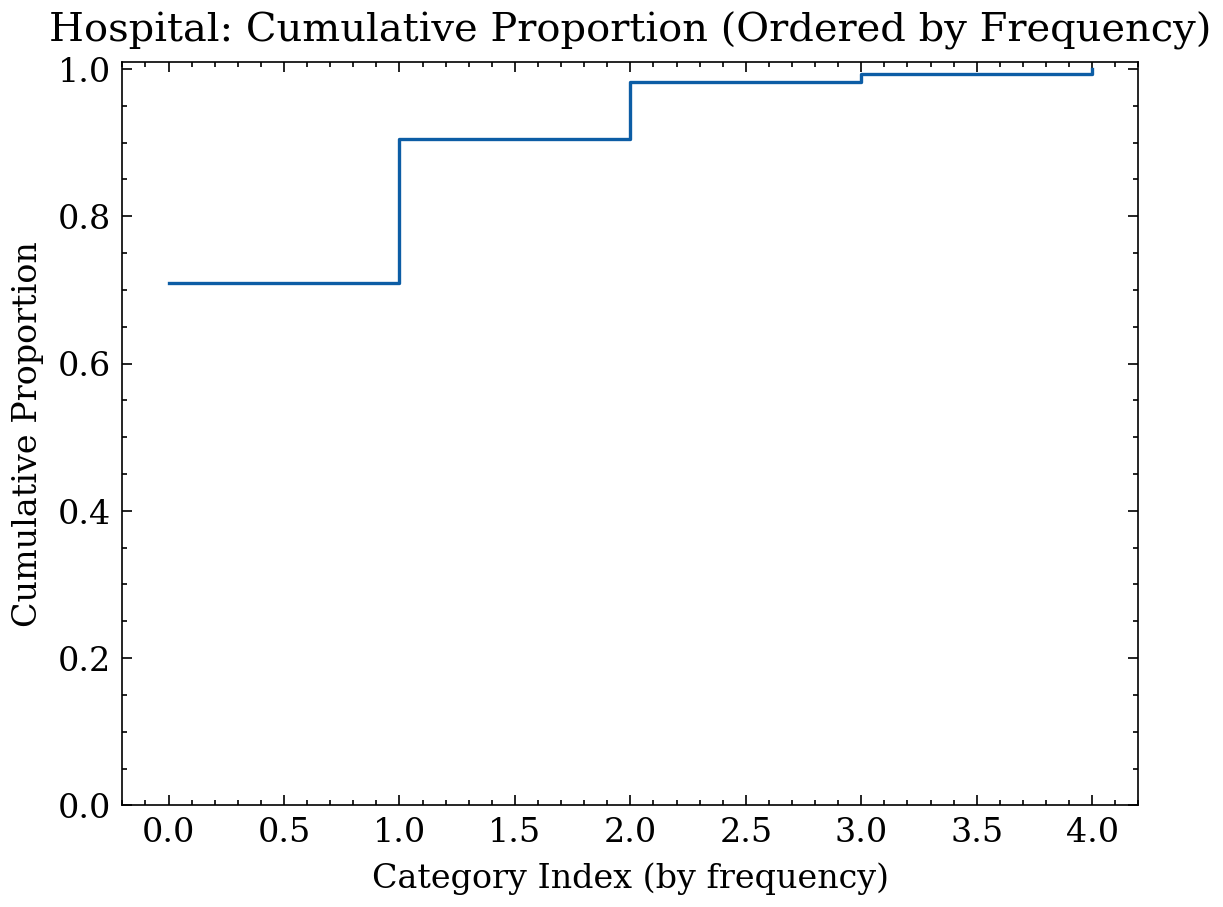
Furthermore, cumulative proportion \(P_k\) reveals tail behavior and concentration: if a small number of values accounts for a large proportion of mass, it may indicate (i) an inherently skewed distribution, (ii) systematic capture errors (rounding, truncation), or (iii) mixed sub-populations. In all cases, EDA produces quantitative evidence to guide recoding categories, imputing missing values, transforming scales, or segmenting the analysis.
23.1.3 Categorical Example: Bar Chart + Cumulative Curve
Suppose we analyze hospital appointment data, focusing on the categorical variable “appointment outcome” with categories: “attended”, “no-show”, “cancelled”, “NO SHOW” (semantic duplicate of “no-show”), and “NA” (encoded missing values). The code below generates a synthetic dataset with these features, computes frequencies, proportions, and cumulative proportions, and plots bar charts and a frequency-ordered cumulative curve (Pareto style).
import numpy as np
import matplotlib.pyplot as plt
import matplotlib as mpl
import scienceplots
plt.style.use('science')
mpl.rcParams["text.usetex"] = False
mpl.rcParams["figure.figsize"] = (5, 4)
mpl.rcParams["figure.dpi"] = 120

rng = np.random.default_rng(7)

# Hospital categorical variable: appointment outcome
# Includes semantic duplicate "NO SHOW" and missing values encoded as "NA"
cats = np.array(["attended", "no_show", "cancelled", "NO SHOW", "NA"])
p = np.array([0.72, 0.18, 0.08, 0.02, 0.01])
p = p / p.sum()

x = rng.choice(cats, size=800, p=p)

# Counts and proportions
vals, counts = np.unique(x, return_counts=True)
order = np.argsort(-counts)  # sort descending by frequency for Pareto-style reading
vals, counts = vals[order], counts[order]
n = counts.sum()
props = counts / n
cum_props = np.cumsum(props)

# Frequency bar chart
plt.figure()
plt.bar(vals.astype(str), counts)
plt.title("Hospital: Frequencies of appointment_outcome")
plt.xlabel("appointment_outcome")
plt.ylabel("Frequency")
plt.xticks(rotation=30, ha="right")
plt.tight_layout()
plt.show()

# Cumulative proportion (Pareto style, ordered by frequency)
plt.figure()
plt.step(np.arange(len(vals)), cum_props, where="post")
plt.title("Hospital: Cumulative Proportion (Ordered by Frequency)")
plt.xlabel("Category Index (by frequency)")
plt.ylabel("Cumulative Proportion")
plt.ylim(0, 1.01)
plt.tight_layout()
plt.show()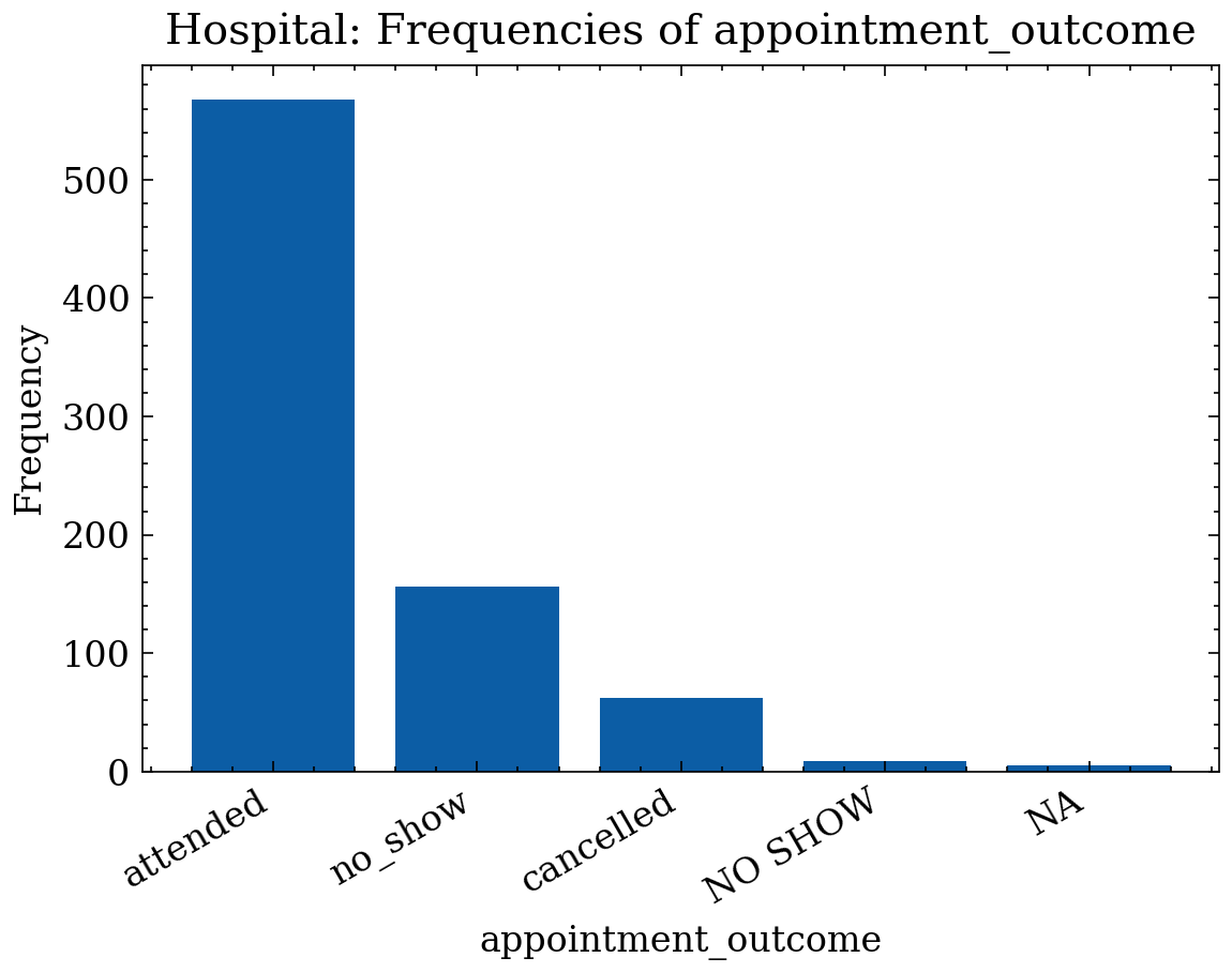
23.1.4 Discrete Example: Counts + Cumulative Curve by Value
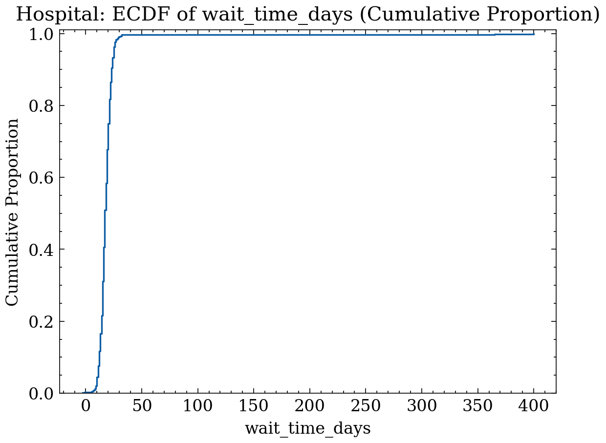
For a discrete variable (counts or grades), inspecting frequency by value and cumulative proportion by natural value order is recommended.
For our hospital example, consider the variable “wait_time_days” between appointment booking and appointment date. This variable is discrete (day count) with a typical range (0–60), but may contain invalid values (negatives, bad date parses). The code below generates a synthetic dataset with these traits, computes frequencies per value, proportions, and cumulative curves (ECDF).
rng = np.random.default_rng(11)

# Hospital discrete variable: wait time in days between request and appointment
# Most fall between 0 and 60, but deliberate invalid/extreme values are injected.
base = rng.poisson(lam=18, size=700)         # typical wait mass (0..~50)
base = np.clip(base, 0, 60)                  # operational reality/policy

# Deliberate invalid values: negative (inverted dates) and extreme (bad parses)
invalid = np.array([-3, -1, 365, 400])
x = np.concatenate([base, invalid])

# Counts and cumulative curve by natural value order
vals, counts = np.unique(x, return_counts=True)
order = np.argsort(vals)
vals, counts = vals[order], counts[order]
n = counts.sum()
props = counts / n
cum_props = np.cumsum(props)

plt.figure()
plt.bar(vals, counts)
plt.title("Hospital: Frequencies of wait_time_days")
plt.xlabel("wait_time_days")
plt.ylabel("Frequency")
plt.tight_layout()
plt.show()

plt.figure()
plt.step(vals, cum_props, where="post")
plt.title("Hospital: ECDF of wait_time_days (Cumulative Proportion)")
plt.xlabel("wait_time_days")
plt.ylabel("Cumulative Proportion")
plt.ylim(0, 1.01)
plt.tight_layout()
plt.show()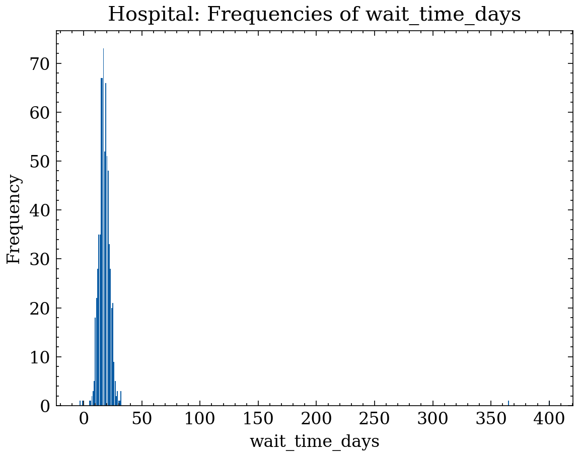
24 Measures of Location (Central Tendency)
In univariate analysis, measures of location serve as an anchor describing where the mass of the distribution is centered. From a data treatment perspective, their utility extends beyond description: they dictate imputation strategies, influence the numerical stability of transformations, and help diagnose sensitivity to heavy tails and outliers. When skewness or outliers are present, different measures of location separate “typical” values from “extreme” values, guiding decisions like using log transformations, robust rules (IQR), or quantile-based imputation.
24.1 Mean
For \(n\) observations \(x_1,\dots,x_n\), the sample mean (average) is:
\[ \bar{x} \;=\; \frac{1}{n}\sum_{i=1}^n x_i. \]
The mean possesses a fundamental algebraic property called linearity (or affinity)4:
4 Linearity/Affinity: property where transforming data by \(aX+b\) (scaling by \(a\) and shifting by \(b\)) transforms the mean identically: \(\overline{aX+b}=a\bar{X}+b\).
\[ \overline{aX+b} \;=\; a\,\bar{X} + b, \]
which explains why it is natural in additive models and behaves predictably under shift and scale operations. However, its primary drawback in EDA is its lack of robustness5: a single extreme value can disproportionately shift \(\bar{x}\). This occurs because the mean averages magnitudes and thus directly reflects the magnitude of any outlier6.
5 Robustness: capability of a statistic to remain stable when subjected to outliers or data contamination.
6 Outlier: an observation extremely large or small relative to the majority of data points.
An operational method to detect this issue is comparing \(\bar{x}\) to the median: if they diverge significantly, skewness and/or heavy tails are likely present, signaling the need for robust measures or transformations.
Numerical Example
Suppose \(n=5\) observations: \[ x = (2,\;3,\;3,\;4,\;8). \] 1) Sum: \[ \sum_{i=1}^5 x_i = 2+3+3+4+8 = 20. \] 2) Mean: \[ \bar{x} = \frac{1}{5}\cdot 20 = 4. \]
Now let us examine the effect of an extreme value: change the last value from \(8\) to \(80\): \[ x'=(2,\;3,\;3,\;4,\;80). \] 1) Sum: \[ \sum_{i=1}^5 x'_i = 2+3+3+4+80 = 92. \] 2) Mean: \[ \bar{x}' = \frac{92}{5} = 18.4. \]
Interpretation: modifying just one data point (from 8 to 80) increases the mean from 4 to 18.4, illustrating its sensitivity to outliers.
24.2 Median
The median is the 0.5 quantile (the “central value”)7. If \(x_{(1)}\le \dots \le x_{(n)}\) represents ordered sample data, then:
7 Quantile: value leaving a fixed proportion of observations below it. The 0.5 quantile (50th percentile) is the median: approximately half the data falls \(\le \tilde{x}\) and the other half \(\ge \tilde{x}\).
\[ \tilde{x} \;=\; \begin{cases} x_{((n+1)/2)} & \text{if $n$ is odd},\\[6pt] \frac{1}{2}\left(x_{(n/2)} + x_{(n/2+1)}\right) & \text{if $n$ is even}. \end{cases} \]
Unlike the mean, the median depends on order rather than exact magnitudes of extreme values. Consequently, it is a robust measure8: its value remains stable unless outliers9 alter the central ordering of the sample. In EDA, this property is valuable for:
8 Robustness: capability of a statistic to remain stable when subjected to outliers or data contamination.
9 Outlier: an observation extremely large or small relative to the majority of data points.
- describing the “typical value” when distributions are skewed (e.g., times, income, amounts);
- defining robust imputation for continuous variables containing outliers;
- comparing against \(\bar{x}\) to diagnose skewness (if \(\bar{x}>\tilde{x}\), right-skewness is indicated).
Numerical Example
Case 1: \(n\) odd
Data: \(x=(2,\,3,\,3,\,4,\,80)\) (already sorted).
Since \(n=5\) is odd, the median is the central element:
\[ \tilde{x}=x_{((5+1)/2)}=x_{(3)}=3. \]
Case 2: \(n\) even
Data: \(x=(1,\,2,\,4,\,7)\) (sorted).
Since \(n=4\) is even, we average the two middle elements:
\[ \tilde{x}=\frac{1}{2}\left(x_{(4/2)}+x_{(4/2+1)}\right) =\frac{1}{2}(x_{(2)}+x_{(3)}) =\frac{1}{2}(2+4)=3. \]
Interpretation: in Case 1, despite the presence of an extreme value (80), the median remains 3, demonstrating robustness.
24.3 Mode
The mode is the value (or category) with maximum frequency10. For discrete or categorical variables, it can be formalized as:
10 Frequency (Absolute): number of occurrences of a value/category in the sample.
\[ \operatorname{mode}(x)\;=\;\arg\max_{v_k}\; f_k, \]
where \(f_k\) is the absolute frequency of level \(v_k\). It is particularly informative for nominal variables11 (where mean and median are undefined) and in discrete data with a dominant spike (e.g., zero inflation).
11 Nominal Variable: categories without intrinsic order (e.g., “attended/no-show/cancelled”, “hospital”, “payment method”). Mean and median are undefined for nominal variables.
12 Multimodality: condition where multiple modes exist (several values/categories tie for highest frequency).
In data cleaning, the mode often highlights encoding issues: if “NA”, “Not applicable”, or “-” emerges as the most frequent category, capture or standardization failures are likely. The mode can also be ambiguous if multiple categories tie for maximum frequency (multimodality)12, requiring reporting as a set of modes or switching summary approaches.
Numerical Example
Case 1: Unimodal
Categorical sample: \[ x=(\text{attended},\ \text{no-show},\ \text{attended},\ \text{cancelled},\ \text{attended}). \] Frequency count:
- \(f(\text{attended})=3\)
- \(f(\text{no-show})=1\)
- \(f(\text{cancelled})=1\)
Since 3 is the highest frequency, the mode is: \[ \operatorname{mode}(x)=\text{attended}. \]
Case 2: Bimodal
Sample: \[
x=(1,\ 1,\ 2,\ 2,\ 3).
\] Frequencies: \(f(1)=2\), \(f(2)=2\), \(f(3)=1\).
A tie exists for highest frequency, resulting in two modes: \[
\operatorname{mode}(x)=\{1,\,2\}.
\]
24.4 E-commerce Example: Order Amounts with Right Skew (Mean vs. Median)
Context: continuous variable order_amount (MXN) in an online store. Most orders are moderate, but very large purchases (b2b, wholesale) or anomalous records (decimal errors) exist, creating a right-skewed distribution with outliers.
EDA Diagnosis: - If \(\bar{x} \gg \tilde{x}\), the distribution is right-skewed and driven by a few very high amounts. - In this scenario, the mean fails to represent “typical” spending; the median serves as a better robust center. - The ECDF reveals operational percentiles (e.g., P90, P95, P99) for setting audit thresholds (extreme values for manual review). - Typical actions: applying \(\log(1+x)\) transformations for modeling, winsorizing extremes, or segmenting (retail vs. wholesale).
# Order amount: majority "normal" (lognormal) + few large orders (outliers)
base = rng.lognormal(mean=4.5, sigma=0.45, size=800)    # typical amounts
outliers = rng.lognormal(mean=7.2, sigma=0.25, size=10) # huge orders
monto_compra = np.concatenate([base, outliers])

mean = monto_compra.mean()
median = np.median(monto_compra)

# Approximate mode for continuous variable using highest frequency bin
bins = 50
counts, bin_edges = np.histogram(monto_compra, bins=bins)
max_bin_idx = np.argmax(counts)
mode_approx = 0.5 * (bin_edges[max_bin_idx] + bin_edges[max_bin_idx + 1])

plt.figure()
plt.hist(monto_compra, bins=bins, alpha=0.45, edgecolor="white")
plt.title("E-commerce: Histogram of order_amount (Right-skewed)")
plt.xlabel("order_amount (MXN)")
plt.ylabel("Frequency")

plt.axvline(mean,   color="tab:blue",   linestyle="--", linewidth=2, label=f"Mean = {mean:.0f}")
plt.axvline(median, color="tab:orange", linestyle="-",  linewidth=2, label=f"Median = {median:.0f}")
plt.axvline(mode_approx, color="tab:green", linestyle=":", linewidth=2,
            label=f"Mode (approx) = {mode_approx:.0f}")

plt.legend()
plt.tight_layout()
plt.show()

# ECDF for percentiles and tail behavior
x_sorted = np.sort(monto_compra)
y = np.arange(1, x_sorted.size + 1) / x_sorted.size

plt.figure()
plt.step(x_sorted, y, where="post")
plt.title("E-commerce: ECDF of order_amount (Percentiles & Tail)")
plt.xlabel("order_amount (MXN)")
plt.ylabel("Cumulative Proportion")
plt.ylim(0, 1.01)
plt.tight_layout()
plt.show()

p90, p95, p99 = np.quantile(monto_compra, [0.90, 0.95, 0.99])
print(f"P90={p90:.0f} MXN, P95={p95:.0f} MXN, P99={p99:.0f} MXN")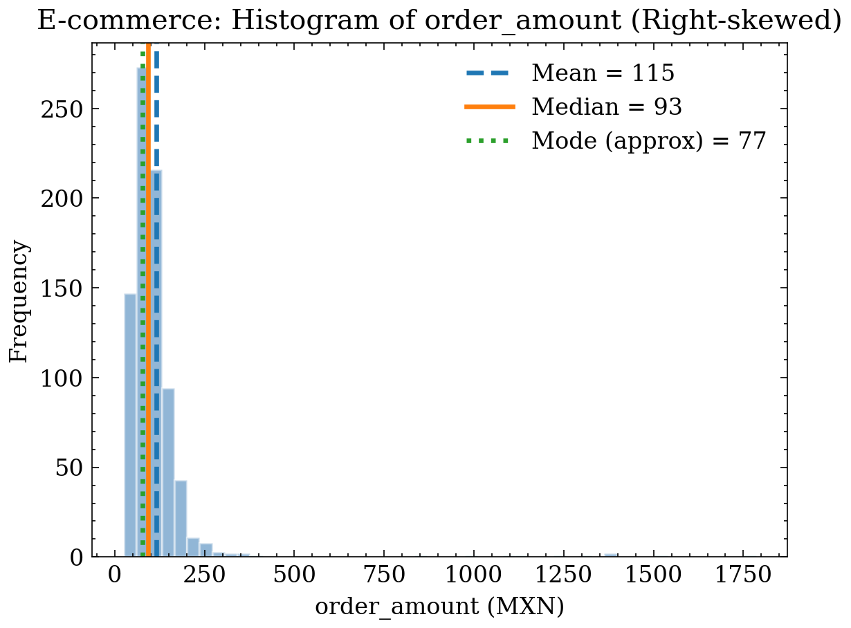
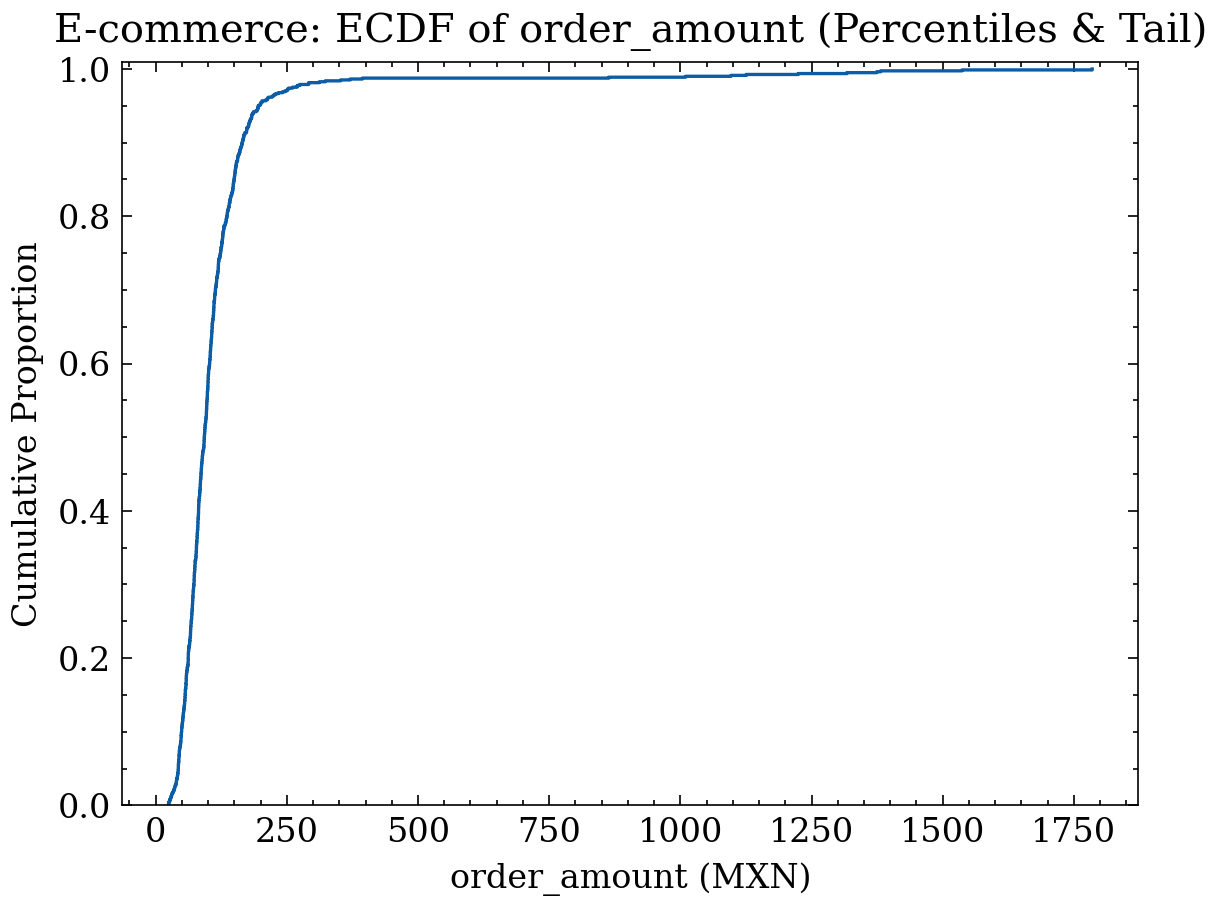
P90=165 MXN, P95=196 MXN, P99=997 MXN25 Shape Measures: Skewness and Kurtosis
In addition to knowing where a distribution is centered (mean/median), EDA seeks to characterize its overall geometry. Shape measures describe whether the distribution is skewed toward one side (skewness) and how extreme its tails are (kurtosis). This is crucial for choosing transformations (log, Box–Cox), detecting heavy tails, and justifying robust techniques in the presence of outliers.
Shape measures rely on sample central moments. For a sample \(x_1,\dots,x_n\) with mean \(\bar{x}\), the \(r\)-th central moment is defined as:
\[ m_r \;=\; \frac{1}{n}\sum_{i=1}^n (x_i-\bar{x})^r. \]
In particular, \(m_2\) captures dispersion; \(m_3\) and \(m_4\) capture shape features (skewness and tail heaviness) beyond variance.
25.1 Skewness
Skewness measures whether a distribution extends further or carries more mass toward the right or left. It is defined as the normalized third central moment:
\[ \mathrm{skew} \;=\; \frac{m_3}{m_2^{3/2}}. \]
Practical interpretation: - \(\mathrm{skew} > 0\): longer right tail (income, amounts, durations). - \(\mathrm{skew} < 0\): longer left tail (capped variables with few very low values). - \(\mathrm{skew} \approx 0\): approximately symmetric distribution.
EDA Purpose: High skewness indicates that the mean may be unrepresentative, suggesting monotonic transformations (such as \(\log(1+x)\)) or robust summaries (median/IQR).
Numerical Example
Consider a small right-skewed sample:
\[ x=(1,\;2,\;2,\;3,\;10), \quad n=5. \]
- Mean:
\[ \bar{x}=\frac{1+2+2+3+10}{5}=\frac{18}{5}=3.6. \]
- Deviations from the mean \((x_i-\bar{x})\):
- \(1-3.6=-2.6\)
- \(2-3.6=-1.6\)
- \(2-3.6=-1.6\)
- \(3-3.6=-0.6\)
- \(10-3.6=6.4\)
- Second Central Moment (dispersion):
\[ m_2=\frac{1}{5}\left[(-2.6)^2+(-1.6)^2+(-1.6)^2+(-0.6)^2+(6.4)^2\right] \]
Calculation:
- \((-2.6)^2=6.76\)
- \((-1.6)^2=2.56\) (twice)
- \((-0.6)^2=0.36\)
- \((6.4)^2=40.96\)
Sum \(=6.76+2.56+2.56+0.36+40.96=53.20\), thus:
\[ m_2=\frac{53.20}{5}=10.64. \]
- Third Central Moment (unnormalized skewness):
\[ m_3=\frac{1}{5}\left[(-2.6)^3+(-1.6)^3+(-1.6)^3+(-0.6)^3+(6.4)^3\right] \]
Calculation:
- \((-2.6)^3=-17.576\)
- \((-1.6)^3=-4.096\) (twice)
- \((-0.6)^3=-0.216\)
- \((6.4)^3=262.144\)
Sum \(=-17.576-4.096-4.096-0.216+262.144=236.160\), thus:
\[ m_3=\frac{236.160}{5}=47.232. \]
- Skewness:
\[ \mathrm{skew}=\frac{m_3}{m_2^{3/2}} =\frac{47.232}{(10.64)^{3/2}}. \]
Since \((10.64)^{3/2}=10.64\sqrt{10.64}\approx 10.64(3.262)\approx 34.70\),
\[ \mathrm{skew}\approx \frac{47.232}{34.70}\approx 1.36. \]
Conclusion: \(\mathrm{skew}\approx 1.36>0\), consistent with a right tail (the value 10 pulls the distribution to the right).
25.1.1 Plot: Symmetric vs. Skewed Distribution (Skewness)
Here we examine system response times (API / microservices). This variable type is typically right-skewed: most requests are fast, but slow queries, load spikes, or network latency produce a long right tail.
rng = np.random.default_rng(123)
n = 5000

# Case 1 (Symmetric): stable noise around a typical latency
lat_sym = rng.normal(loc=120.0, scale=15.0, size=n)
lat_sym = np.clip(lat_sym, 1e-3, None)

# Case 2 (Skewed): latencies with right tail (lognormal)
lat_skew = rng.lognormal(mean=np.log(120.0), sigma=0.35, size=n)

def skew_kurt(x):
    x = np.asarray(x)
    mu = x.mean()
    m2 = np.mean((x - mu)**2)
    m3 = np.mean((x - mu)**3)
    m4 = np.mean((x - mu)**4)
    skew = m3 / (m2**1.5)
    kurt = m4 / (m2**2)
    return skew, kurt

sk_sym, ku_sym = skew_kurt(lat_sym)
sk_skew, ku_skew = skew_kurt(lat_skew)

plt.figure()
plt.hist(lat_sym,  bins=70, density=True, alpha=0.35, label=f"Stable (skew={sk_sym:.2f})")
plt.hist(lat_skew, bins=70, density=True, alpha=0.35, label=f"Heavy-tailed (skew={sk_skew:.2f})")
plt.title("Skewness in Latencies: Symmetric vs. Skewed (Density)")
plt.xlabel("latency (ms)")
plt.ylabel("Density")
plt.legend()
plt.tight_layout()
plt.show()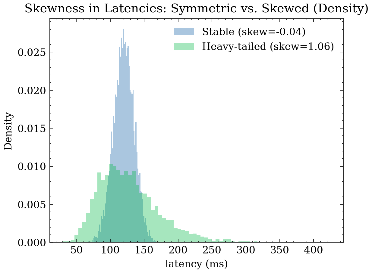
25.2 Kurtosis
Kurtosis measures tail weight relative to central dispersion. In EDA, it is interpreted as an indicator of heavy tails and thus a higher probability of observing extreme values. It is defined as the normalized fourth central moment:
\[ \mathrm{kurt} \;=\; \frac{m_4}{m_2^{2}}. \]
A standard Normal distribution satisfies \(\mathrm{kurt}=3\), so excess kurtosis is frequently reported:
\[ \mathrm{kurt\_excess} \;=\; \mathrm{kurt}-3. \]
Practical interpretation: - High \(\mathrm{kurt}\) (positive excess): heavy tails → higher expectation of outliers/extremes. - \(\mathrm{kurt} \approx 3\): tails similar to Normal. - Low \(\mathrm{kurt}\) (negative excess): light tails → rare extreme values.
EDA Purpose: High kurtosis prompts data quality audits (data errors vs. true rare cases), use of robust statistical methods, or segmentation/transformations prior to fitting outlier-sensitive models.
Numerical Example
Consider a small sample with extreme values (heavy tails):
\[ x=(0,\;0,\;0,\;0,\;10), \quad n=5. \]
- Mean:
\[ \bar{x}=\frac{0+0+0+0+10}{5}=\frac{10}{5}=2. \]
- Deviations \((x_i-\bar{x})\):
- for the four zeros: \(0-2=-2\)
- for the ten: \(10-2=8\)
- Second Central Moment:
\[ m_2=\frac{1}{5}\left[(-2)^2+(-2)^2+(-2)^2+(-2)^2+(8)^2\right] \]
\[ m_2=\frac{1}{5}\left[4+4+4+4+64\right] =\frac{80}{5}=16. \]
- Fourth Central Moment:
\[ m_4=\frac{1}{5}\left[(-2)^4+(-2)^4+(-2)^4+(-2)^4+(8)^4\right] \]
\[ m_4=\frac{1}{5}\left[16+16+16+16+4096\right] =\frac{4160}{5}=832. \]
- Kurtosis:
\[ \mathrm{kurt}=\frac{m_4}{m_2^2} =\frac{832}{16^2} =\frac{832}{256} =3.25. \]
- Excess Kurtosis:
\[ \mathrm{kurt\_excess}=\mathrm{kurt}-3=3.25-3=0.25. \]
Conclusion: kurtosis is greater than 3 (positive excess), consistent with heavier tails driven by the extreme observation dominating the fourth moment.
25.2.1 Plot: Distributions with Equal Mean and Variance (Kurtosis)
This plot shows how two variables can share the same mean and variance while one produces far more extreme values (heavy tails). This distinction drives decisions like using median/IQR, winsorization, segmentation, log transforms, or robust models.
rng = np.random.default_rng(202)
n = 6000
mu_target = 2.0

# Normal with var=1
xN = rng.normal(loc=0.0, scale=1.0, size=n)

# Laplace centered and scaled for var=1 (Var = 2 b^2 => b = 1/sqrt(2))
b = 1/np.sqrt(2)
xL = rng.laplace(loc=0.0, scale=b, size=n)

# Student's t(df=5) scaled for var=1 (Var = df/(df-2))
df = 5
xT = rng.standard_t(df=df, size=n)
xT = xT / np.sqrt(df/(df-2))

# Match means
xN = xN + mu_target
xL = xL + mu_target
xT = xT + mu_target

def stats_basic(x):
    x = np.asarray(x)
    mu = x.mean()
    m2 = np.mean((x - mu)**2)
    m3 = np.mean((x - mu)**3)
    m4 = np.mean((x - mu)**4)
    skew = m3 / (m2**1.5)
    kurt = m4 / (m2**2)
    return mu, m2, skew, kurt

muN, varN, skN, kuN = stats_basic(xN)
muL, varL, skL, kuL = stats_basic(xL)
muT, varT, skT, kuT = stats_basic(xT)

print("Summary (mean, var, skew, kurt):")
print(f"Normal : {muN:.3f}, {varN:.3f}, {skN:.3f}, {kuN:.3f}")
print(f"Laplace: {muL:.3f}, {varL:.3f}, {skL:.3f}, {kuL:.3f}")
print(f"t(df=5): {muT:.3f}, {varT:.3f}, {skT:.3f}, {kuT:.3f}")

plt.figure()
plt.hist(xN, bins=70, alpha=0.55, label=f"Normal  (kurt={kuN:.2f})")
plt.hist(xL, bins=70, alpha=0.55, label=f"Laplace (kurt={kuL:.2f})")
plt.hist(xT, bins=70, alpha=0.55, label=f"t(df=5) (kurt={kuT:.2f})")
plt.title("Kurtosis: Equal Mean and Variance (var≈1), Different Tails")
plt.xlabel("x")
plt.ylabel("Frequency")
plt.legend()
plt.tight_layout()
plt.show()
Summary (mean, var, skew, kurt):
Normal : 1.979, 1.029, -0.010, 2.933
Laplace: 2.032, 0.964, 0.264, 6.300
t(df=5): 2.006, 0.992, -0.106, 6.092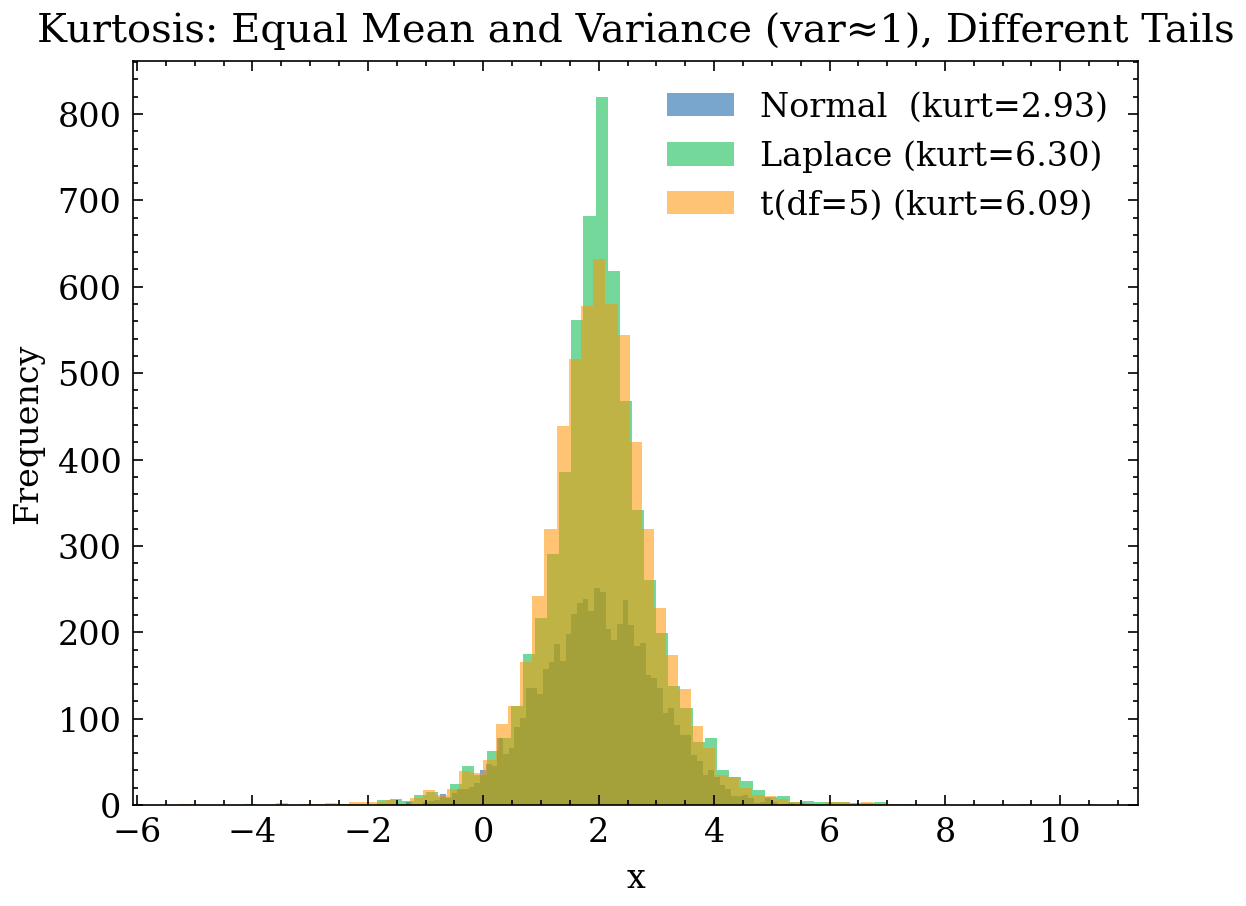
25.3 Overall Comparison: Skewness and Kurtosis at a Glance
This combined plot compares four representative distributions on a common scale: - a symmetric baseline (Normal), - a skewed distribution (rescaled Lognormal), - a moderate heavy-tailed distribution (Laplace), - a heavy-tailed distribution (Student’s t with df=3).
rng = np.random.default_rng(404)
n = 7000

x_norm = rng.normal(0.0, 1.0, size=n)

# Skewed (rescaled to mean 0, var 1 to compare shape)
x_logn = rng.lognormal(mean=0.0, sigma=0.65, size=n)
x_logn = (x_logn - x_logn.mean()) / x_logn.std()

# Laplace with var≈1
b = 1/np.sqrt(2)
x_lap = rng.laplace(loc=0.0, scale=b, size=n)

# Student's t(df=3) rescaled to var≈1
x_t3 = rng.standard_t(df=3, size=n) / np.sqrt(3)

def skew_kurt(x):
    x = np.asarray(x)
    mu = x.mean()
    m2 = np.mean((x - mu)**2)
    m3 = np.mean((x - mu)**3)
    m4 = np.mean((x - mu)**4)
    skew = m3 / (m2**1.5)
    kurt = m4 / (m2**2)
    return skew, kurt

datasets = [
    ("Normal", x_norm),
    ("Lognormal (skewed)", x_logn),
    ("Laplace (heavier tails)", x_lap),
    ("t(df=3) (heavy tails)", x_t3),
]

allx = np.concatenate([x for _, x in datasets])
lo, hi = np.quantile(allx, [0.005, 0.995])

fig, ax = plt.subplots(figsize=(10, 5))
for name, x in datasets:
    sk, ku = skew_kurt(x)
    ax.hist(
        x,
        bins=80,
        range=(lo, hi),
        alpha=0.30,
        density=True,
        label=f"{name}  (sk={sk:.2f}, ku={ku:.2f})"
    )

ax.set_title("Combined Comparison: Skewness and Kurtosis")
ax.set_xlabel("x (comparable scale)")
ax.set_ylabel("Density")

ax.legend(loc="center left", bbox_to_anchor=(1.02, 0.5), frameon=False)
fig.tight_layout()
plt.show()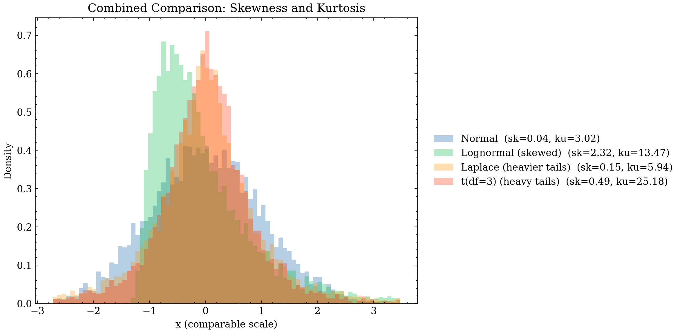
26 Measures of Variability (Dispersion)
Variability measures how spread out data points are around a measure of location (mean or median). Measuring dispersion is essential in EDA: it indicates whether a variable provides useful signal, reveals sub-population heterogeneity, and highlights scale imbalances that can disrupt model training (e.g., gradient instability when one feature’s magnitude dominates others). Furthermore, dispersion provides the context for outlier detection: a large value is only anomalous relative to the typical scale of the distribution.
26.1 Variance and Standard Deviation
Theoretically, population variance is defined as the expected squared deviation from the mean:
\[ \sigma^2 \;=\; \mathbb{E}\!\left[(X-\mu)^2\right]. \]
For a sample \(x_1,\dots,x_n\), the unbiased sample variance and standard deviation are:
\[ s^2 \;=\; \frac{1}{n-1}\sum_{i=1}^n (x_i-\bar{x})^2, \qquad s \;=\; \sqrt{s^2}. \]
Interpretation: \(s\) measures the “typical scale” of fluctuation around \(\bar{x}\). If \(s\approx 0\), the variable is nearly constant; in modeling it provides minimal predictive value or indicates data capture defects (repeated sensor values, unpopulated fields).
Connection to treatment: standard scaling (z-score) transforms values as:
\[ z_i \;=\; \frac{x_i-\bar{x}}{s}, \]
putting variables on comparable scales and stabilizing gradient-based algorithms. If \(s\) is extremely small, scaling amplifies noise; in such cases, drop the feature or use alternative scaling (e.g., IQR scaling).
26.1.1 Plot: Same Mean, Different Standard Deviation (1D)
Hypothetical scenario: bolt diameters produced by two machines A and B, both sharing the same mean (meeting specifications on average), but exhibiting different variability.
EDA Insight: - Comparing only means masks the issue: both machines appear identical. - Measuring \(s\) exposes inconsistent manufacturing quality: the high-\(s\) machine yields significantly more out-of-tolerance parts.
rng = np.random.default_rng(10)
n = 3000
mu = 5.0

x_small = rng.normal(loc=mu, scale=0.5, size=n)
x_large = rng.normal(loc=mu, scale=2.0, size=n)

plt.figure()
plt.hist(x_small, bins=60, alpha=0.6, label=f"σ≈0.5 (s={x_small.std(ddof=1):.2f})")
plt.hist(x_large, bins=60, alpha=0.6, label=f"σ≈2.0 (s={x_large.std(ddof=1):.2f})")
plt.title("Standard Deviation: Equal Mean, Different Dispersion")
plt.xlabel("x")
plt.ylabel("Frequency")
plt.legend()
plt.tight_layout()
plt.show()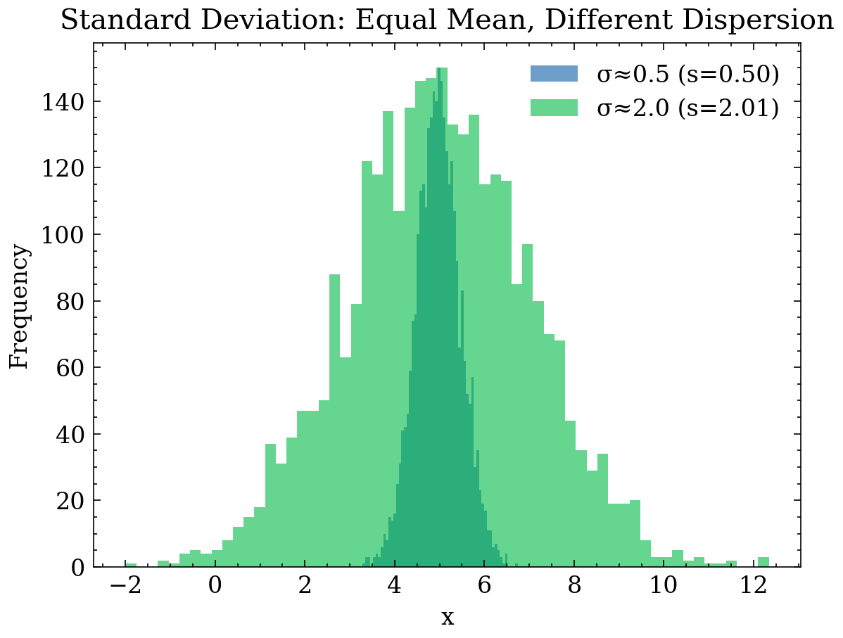
26.1.2 Plot: 2D Dispersion (Scatter) Controlled by \(s_x, s_y\)
Across two variables \((X,Y)\), variability manifests as a spread-out point cloud. Here we compare two datasets sharing equal means but differing dispersion scales.
rng = np.random.default_rng(12)
n = 800

mu_x, mu_y = 0.0, 0.0

# Low dispersion
x1 = rng.normal(mu_x, 0.6, size=n)
y1 = rng.normal(mu_y, 0.6, size=n)

# High dispersion
x2 = rng.normal(mu_x, 2.0, size=n)
y2 = rng.normal(mu_y, 2.0, size=n)

plt.figure()
plt.scatter(x1, y1, s=10, alpha=0.6, label="Low dispersion")
plt.scatter(x2, y2, s=10, alpha=0.6, label="High dispersion")
plt.title("2D Scatter: Effect of Dispersion on Point Clouds")
plt.xlabel("X")
plt.ylabel("Y")
plt.legend()
plt.tight_layout()
plt.show()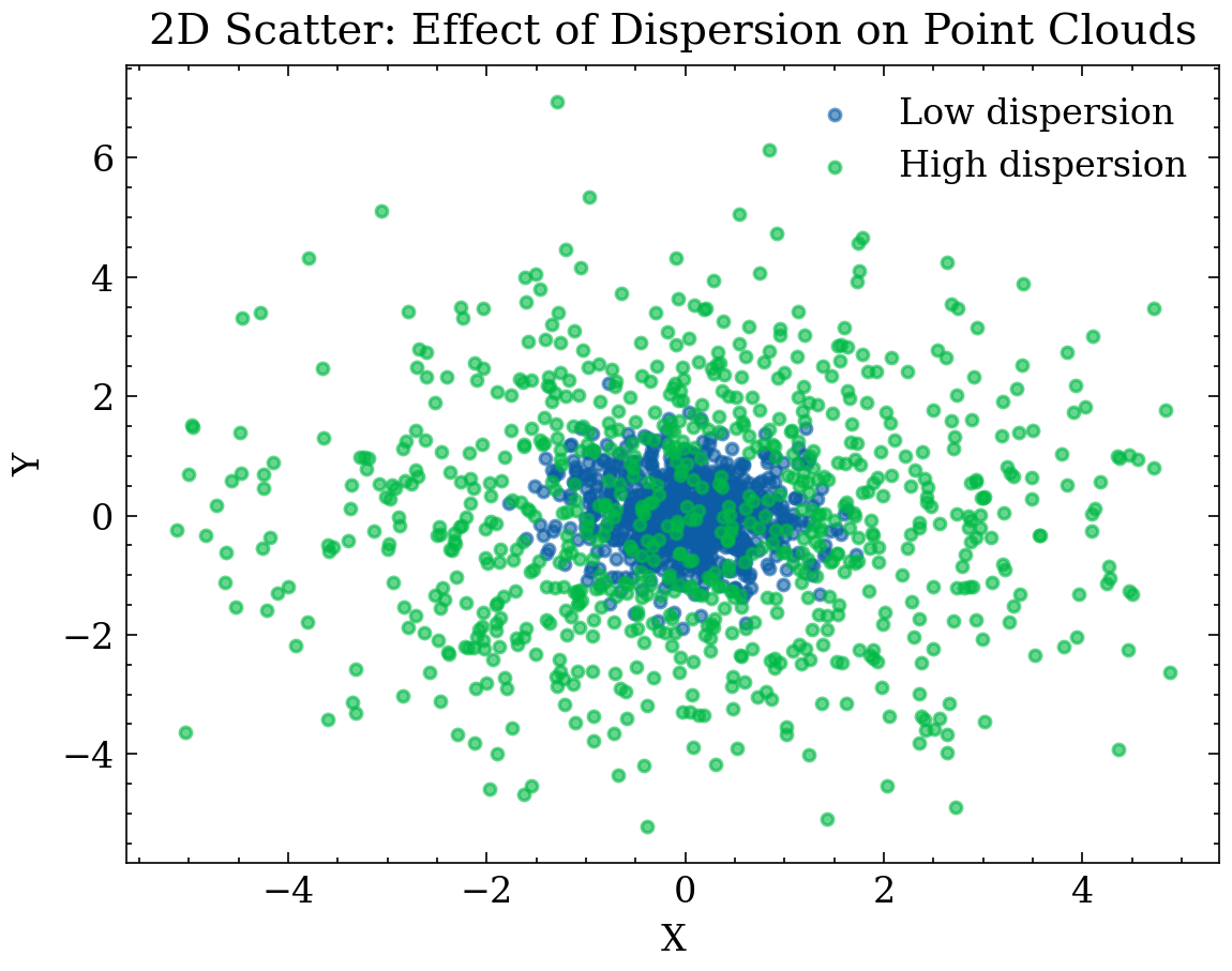
26.2 Quartiles, Range, and IQR
Quartiles split sorted data into four equal 25% quarters: * \(Q_{0.25}\) (Q1): 25th percentile. * \(Q_{0.50}\) (Median): 50th percentile (center). * \(Q_{0.75}\) (Q3): 75th percentile.
The range is the difference between maximum and minimum:
\[ R \;=\; x_{(n)} - x_{(1)}, \]
where \(x_{(1)}\le \dots \le x_{(n)}\) represent sorted observations. Range is intuitive but highly sensitive to single extreme outliers.
The Interquartile Range (IQR) uses quartiles and is robust:
\[ \mathrm{IQR} \;=\; Q_{0.75} - Q_{0.25}. \]
Outlier detection: a classic robust rule flags potential outliers if
\[ x < Q_{0.25} - 1.5\,\mathrm{IQR} \quad \text{or} \quad x > Q_{0.75} + 1.5\,\mathrm{IQR}. \]
The goal is not immediate deletion, but prompting investigation: capture error, sub-population mixing, or genuine extreme event?
26.2.1 Plot: Boxplot (IQR) and Outliers
Context: delivery time in days. Most orders arrive within 2–5 days, but extreme logistics delays (weather, customs) occur.
26.2.2 What is a Boxplot?
A boxplot (box-and-whisker plot) summarizes distribution shape using robust quantiles:
- Median (\(Q_2\)): central value
- First Quartile (\(Q_1\)): 25th percentile
- Third Quartile (\(Q_3\)): 75th percentile
- Interquartile Range (IQR): \[ \mathrm{IQR} = Q_3 - Q_1 \]
The “box” contains the central 50% of the data, while whiskers extend to non-outlier extremes within:
\[ [Q_1 - 1.5 \cdot \mathrm{IQR}, \; Q_3 + 1.5 \cdot \mathrm{IQR}] \]
Observations beyond these limits are drawn as explicit outliers.
26.2.3 How to Interpret a Boxplot?
- Median Position: indicates typical value; non-centered placement signals skewness.
- Box Size (IQR): measures spread of the middle 50% (outlier-robust).
- Whisker Length: shows reach of non-extreme data.
- Outliers (Points outside): highlight atypical values or heavy tails.
26.2.4 EDA Actions
- Report Median + IQR alongside Mean + SD.
- Segment analysis by route, vendor, or location.
- Apply percentiles (P95/P99) to manage extreme values.
rng = np.random.default_rng(21)
base = rng.normal(loc=0.0, scale=1.0, size=600)
out = rng.normal(loc=0.0, scale=1.0, size=8) + 6.0
x = np.concatenate([base, out])

q1, q3 = np.quantile(x, [0.25, 0.75])
iqr = q3 - q1
low = q1 - 1.5 * iqr
high = q3 + 1.5 * iqr

plt.figure()
plt.boxplot(x, vert=True)
plt.title(f"Boxplot: IQR={iqr:.2f}, bounds [{low:.2f}, {high:.2f}]")
plt.ylabel("x")
plt.tight_layout()
plt.show()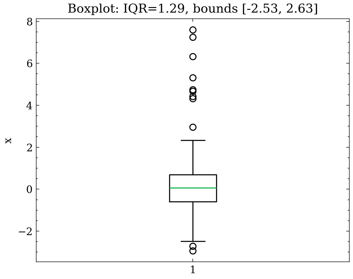
26.3 Coefficient of Variation (CV)
The coefficient of variation measures relative dispersion relative to the mean:
\[ \mathrm{CV} \;=\; \frac{s}{|\bar{x}|}. \]
It is useful for comparing variability across different scales (e.g., relative dispersion of monthly spend vs. session duration). However, if \(|\bar{x}|\approx 0\), CV becomes unstable; alternative normalizations (such as scaling by median or IQR) should be used instead.
rng = np.random.default_rng(33)
n = 2000

a = rng.normal(loc=100.0, scale=10.0, size=n)  # CV ~ 0.1
b = rng.normal(loc=5.0, scale=10.0, size=n)    # High CV (small mean)

cv_a = a.std(ddof=1) / abs(a.mean())
cv_b = b.std(ddof=1) / abs(b.mean())

plt.figure()
plt.hist(a, bins=60, alpha=0.6, label=f"A: mean={a.mean():.1f}, s={a.std(ddof=1):.1f}, CV={cv_a:.2f}")
plt.hist(b, bins=60, alpha=0.6, label=f"B: mean={b.mean():.1f}, s={b.std(ddof=1):.1f}, CV={cv_b:.2f}")
plt.title("Coefficient of Variation: Relative Dispersion")
plt.xlabel("x")
plt.ylabel("Frequency")
plt.legend()
plt.tight_layout()
plt.show()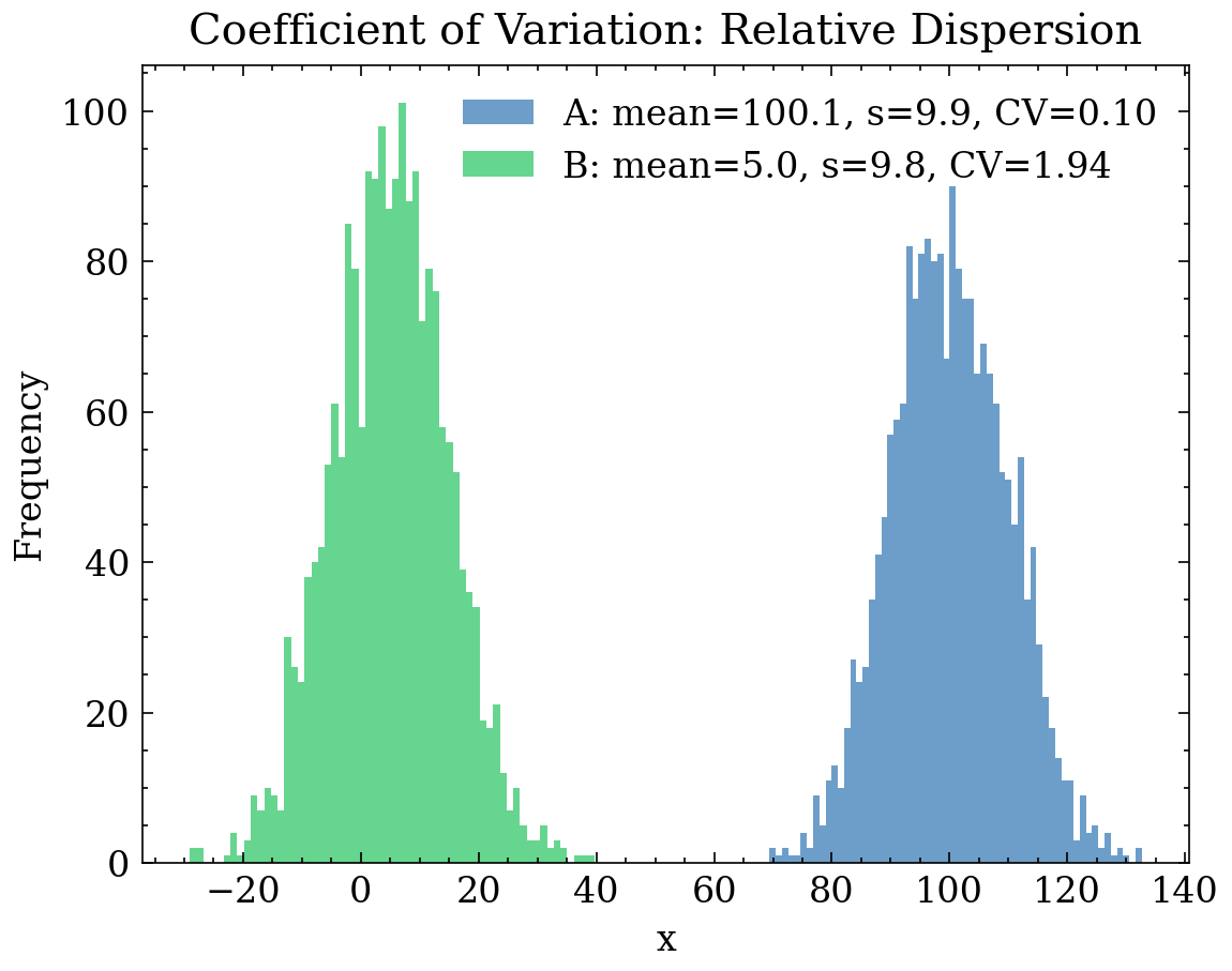
27 Heterogeneity Measures (for Categorical Variables)
For categorical variables, “variability” is interpreted not as spread around a mean, but as distribution heterogeneity: how probability mass is distributed across categories. If nearly all mass falls into one category, the attribute is homogeneous (uninformative); if mass is spread across many categories, the attribute is heterogeneous (informative, but carrying risks of high cardinality and overfitting).
Let \(p=(p_1,\dots,p_K)\) be the empirical distribution across \(K\) categories (\(\sum_k p_k = 1\)), where \(p_k=f_k/n\).
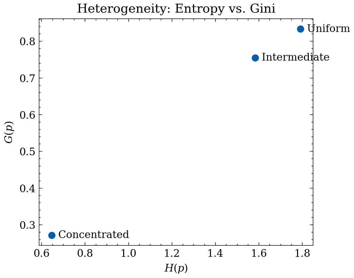
27.1 Shannon Entropy
Shannon entropy measures average uncertainty when observing a category:
\[ H(p) \;=\; -\sum_{k=1}^{K} p_k \log p_k. \]
Interpretation: - \(H(p)\) reaches its maximum when \(p\) is uniform (\(p_k = 1/K\) for all \(k\)):
\[ H_{\max} \;=\; \log K. \]
- \(H(p)\) is zero when a single category completely dominates (\(p_1=1\)).
Normalized entropy enables cross-variable comparisons with differing category counts:
\[ H_{\mathrm{norm}}(p) \;=\; \frac{H(p)}{\log K}\in[0,1]. \]
27.2 Gini Index (Impurity)
The Gini index (or Gini impurity) is defined as:
\[ G(p) \;=\; 1-\sum_{k=1}^{K} p_k^2. \]
Probabilistic interpretation: \(G(p)\) is the probability that two independent observations belong to different categories.
For a uniform distribution (\(p_k=1/K\)):
\[ G_{\max} \;=\; 1-\frac{1}{K}. \]
27.2.1 Plot: Categorical Distributions (Shannon & Gini)
def entropy(p):
    p = np.asarray(p, dtype=float)
    p = p[p > 0]
    return -np.sum(p * np.log(p))

def gini_impurity(p):
    p = np.asarray(p, dtype=float)
    return 1.0 - np.sum(p**2)

K = 6
cats = [f"C{k}" for k in range(1, K+1)]

p_conc = np.array([0.85, 0.05, 0.04, 0.03, 0.02, 0.01])
p_mid  = np.array([0.40, 0.20, 0.15, 0.10, 0.10, 0.05])
p_uni  = np.ones(K) / K

dists = [
    ("Concentrated", p_conc),
    ("Intermediate", p_mid),
    ("Uniform",      p_uni),
]

plt.figure()
x = np.arange(K)
width = 0.25

for i, (name, p) in enumerate(dists):
    plt.bar(x + (i-1)*width, p, width=width, label=name)

plt.title("Categorical Distributions: Concentration vs. Uniformity")
plt.xlabel("Category")
plt.ylabel("Empirical Probability $p_k$")
plt.xticks(x, cats)
plt.ylim(0, 1.0)
plt.legend()
plt.tight_layout()
plt.show()

Hs = [entropy(p) for _, p in dists]
Gs = [gini_impurity(p) for _, p in dists]

plt.figure()
plt.scatter(Hs, Gs)

for (name, _), h, g in zip(dists, Hs, Gs):
    plt.text(h, g, f"  {name}", va="center")

plt.title("Heterogeneity: Entropy vs. Gini")
plt.xlabel("$H(p)$")
plt.ylabel("$G(p)$")
plt.tight_layout()
plt.show()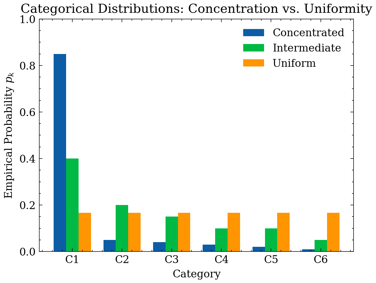
28 Concentration Measures (Inequality)
Concentration measures quantify whether distribution mass is evenly spread or concentrated within a few dominant categories (HHI) or few individuals (Lorenz-Gini for non-negative continuous metrics like sales or wealth).
28.1 Herfindahl–Hirschman Index (HHI)
For a categorical distribution \(p=(p_1,\dots,p_K)\):
\[ \mathrm{HHI} \;=\; \sum_{k=1}^{K} p_k^2. \]
- Uniform distribution: \(\mathrm{HHI}_{\min} = 1/K\).
- Single category dominance: \(\mathrm{HHI}_{\max} = 1\).
- Relation to Gini impurity: \(G(p) = 1 - \mathrm{HHI}\).
28.2 Lorenz Curve and Gini Coefficient (Inequality)
For non-negative continuous variables \(x_i \ge 0\), the Lorenz Curve plots cumulative population fraction \(u_i = i/n\) against cumulative value fraction \(L(u_i) = \frac{\sum_{j=1}^i x_{(j)}}{\sum_{j=1}^n x_{(j)}}\).
The Gini Coefficient is twice the area between the line of perfect equality and the Lorenz curve:
\[ \mathcal{G} \;=\; \frac{\sum_{i=1}^{n}\sum_{j=1}^{n} |x_i-x_j|}{2n^2\bar{x}}. \]
- \(\mathcal{G}\approx 0\): equal distribution.
- High \(\mathcal{G}\): extreme inequality/concentration.
rng = np.random.default_rng(77)
n = 4000

x_uniform = rng.uniform(0.0, 1.0, size=n)
x_exp = rng.exponential(scale=1.0, size=n)
x_logn = rng.lognormal(mean=0.0, sigma=1.0, size=n)

def lorenz_curve(x):
    x = np.asarray(x)
    x = x[x >= 0]
    x_sorted = np.sort(x)
    cum = np.cumsum(x_sorted)
    total = cum[-1]
    u = np.arange(1, x_sorted.size + 1) / x_sorted.size
    L = cum / total if total > 0 else np.zeros_like(cum)
    u = np.concatenate([[0.0], u])
    L = np.concatenate([[0.0], L])
    return u, L

def gini_from_lorenz(u, L):
    area = np.trapz(L, u)
    return 1.0 - 2.0 * area

datasets = [
    ("Uniform(0,1)", x_uniform),
    ("Exponential", x_exp),
    ("Lognormal", x_logn),
]

plt.figure()
u_eq = np.linspace(0, 1, 200)
plt.plot(u_eq, u_eq, linestyle="--", label="Perfect Equality")

for name, x in datasets:
    u, L = lorenz_curve(x)
    g = gini_from_lorenz(u, L)
    plt.plot(u, L, label=f"{name} (Gini={g:.2f})")

plt.title("Lorenz Curves: Inequality Levels")
plt.xlabel("Cumulative Population Fraction $u$")
plt.ylabel("Cumulative Value Fraction $L(u)$")
plt.xlim(0, 1)
plt.ylim(0, 1)
plt.legend()
plt.tight_layout()
plt.show()
/var/folders/s2/zg5b0g5j429cgw58pc03352r0000gn/T/ipykernel_71881/1430139319.py:21: DeprecationWarning: `trapz` is deprecated. Use `trapezoid` instead, or one of the numerical integration functions in `scipy.integrate`.
area = np.trapz(L, u)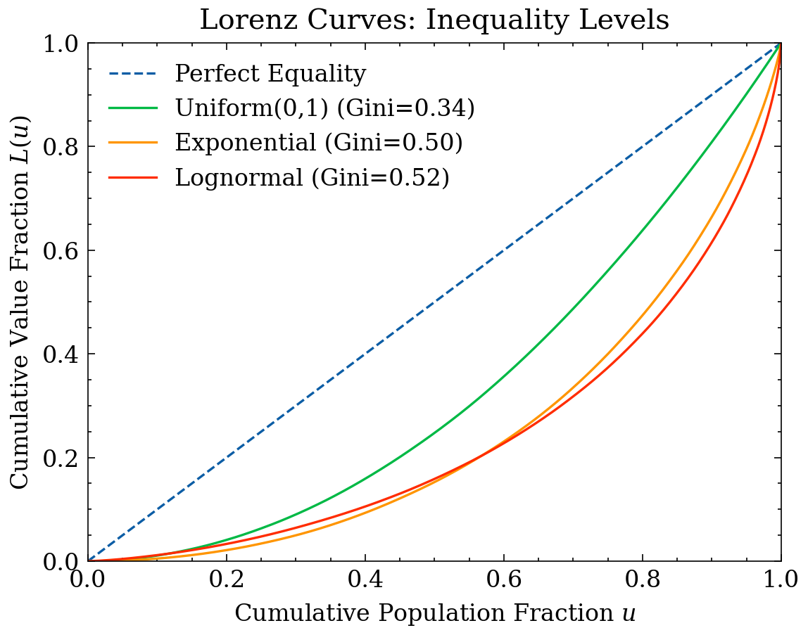
29 Association Measures (Correlation) and Bivariate Visualization
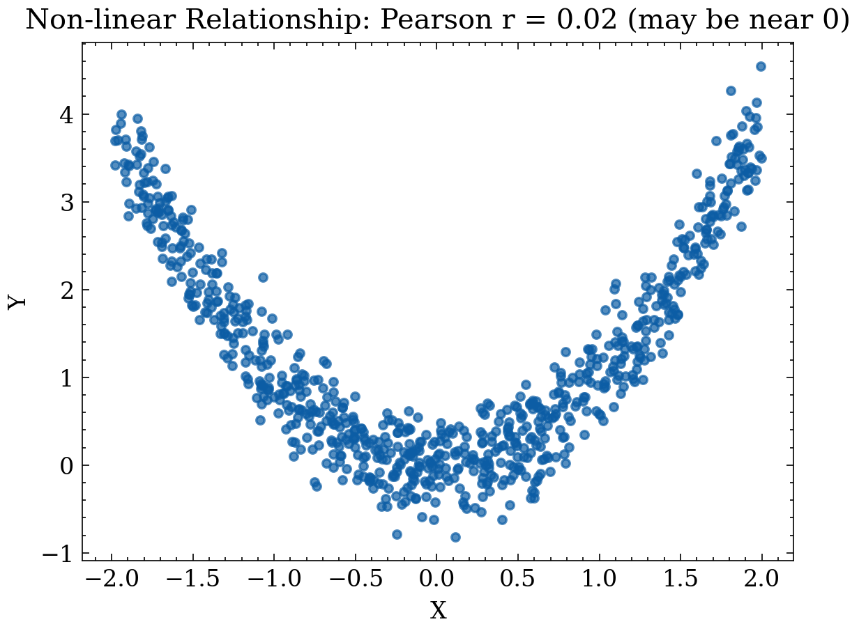
Association measures quantify dependency between variables. In EDA, they identify linear or monotonic relationships, collinearity, and feature redundancy. As emphasized, association does not imply causation: correlation serves to generate hypotheses, not prove mechanisms.
29.1 Covariance and Pearson Correlation (Linear Dependence)
Sample covariance:
\[ s_{XY} \;=\; \frac{1}{n-1}\sum_{i=1}^n (x_i-\bar{x})(y_i-\bar{y}). \]
Pearson correlation:
\[ r_{XY} \;=\; \frac{s_{XY}}{s_X\,s_Y} \in [-1, 1]. \]
rng = np.random.default_rng(9)
n = 800

# Case 1: Linear relationship with noise
x1 = rng.normal(0, 1, size=n)
y1 = 2.0*x1 + rng.normal(0, 0.6, size=n)

# Case 2: Non-linear relationship (parabolic)
x2 = rng.uniform(-2, 2, size=n)
y2 = x2**2 + rng.normal(0, 0.3, size=n)

r1 = np.corrcoef(x1, y1)[0,1]
r2 = np.corrcoef(x2, y2)[0,1]

plt.figure()
plt.scatter(x1, y1, s=12, alpha=0.7)
plt.title(f"Linear Relationship: Pearson r = {r1:.2f}")
plt.xlabel("X")
plt.ylabel("Y")
plt.tight_layout()
plt.show()

plt.figure()
plt.scatter(x2, y2, s=12, alpha=0.7)
plt.title(f"Non-linear Relationship: Pearson r = {r2:.2f} (may be near 0)")
plt.xlabel("X")
plt.ylabel("Y")
plt.tight_layout()
plt.show()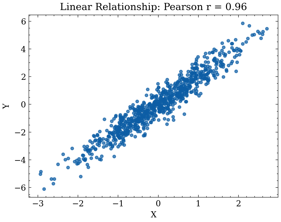
29.2 Spearman Rank Correlation (Monotonic Dependence)
Spearman correlation evaluates Pearson correlation on rank-transformed variables:
\[ \rho_s \;=\; \mathrm{corr}(\mathrm{rank}(X),\,\mathrm{rank}(Y)). \]
It measures monotonic relationships robustly without requiring linearity.
rng = np.random.default_rng(31)
n = 900

x = rng.uniform(-2, 2, size=n)
y = np.exp(x) + rng.normal(0, 0.5, size=n)

pearson = np.corrcoef(x, y)[0,1]
rx = np.argsort(np.argsort(x))
ry = np.argsort(np.argsort(y))
spearman = np.corrcoef(rx, ry)[0,1]

plt.figure()
plt.scatter(x, y, s=10, alpha=0.6)
plt.title(f"Monotonic Non-linear: Pearson r={pearson:.2f}, Spearman ρ={spearman:.2f}")
plt.xlabel("X")
plt.ylabel("Y")
plt.tight_layout()
plt.show()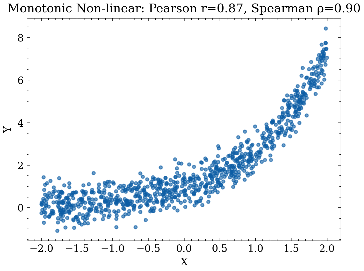
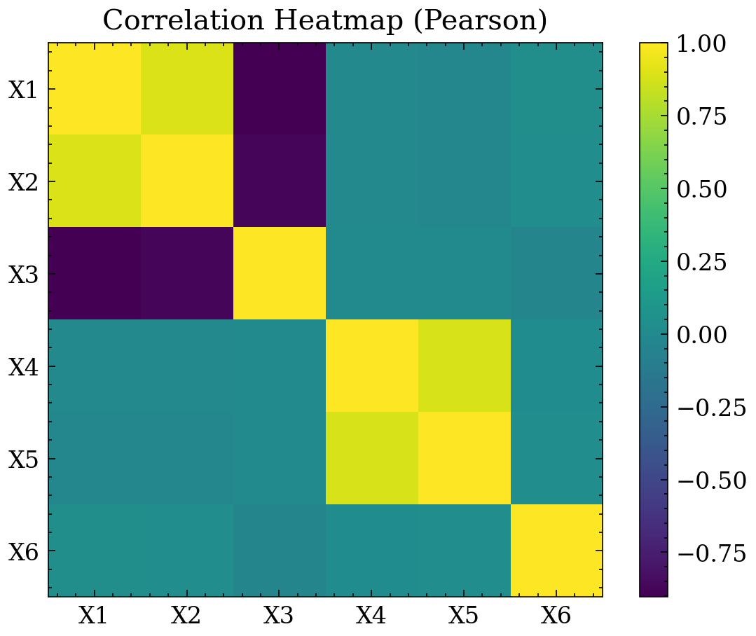
29.3 Correlation Heatmap
A correlation heatmap displays pairwise associations \(R_{ij} = \mathrm{corr}(X_i, X_j)\) across multiple numerical features, revealing collinearity blocks and redundant features.
rng = np.random.default_rng(55)
n = 1200

z1 = rng.normal(size=n)
x1 = z1 + rng.normal(scale=0.3, size=n)
x2 = 0.8*z1 + rng.normal(scale=0.3, size=n)
x3 = -0.9*z1 + rng.normal(scale=0.3, size=n)

z2 = rng.normal(size=n)
x4 = z2 + rng.normal(scale=0.3, size=n)
x5 = 0.7*z2 + rng.normal(scale=0.3, size=n)

x6 = rng.normal(size=n)

X = np.vstack([x1, x2, x3, x4, x5, x6]).T
names = ["X1","X2","X3","X4","X5","X6"]

R = np.corrcoef(X, rowvar=False)

plt.figure()
plt.imshow(R)
plt.title("Correlation Heatmap (Pearson)")
plt.xticks(range(len(names)), names)
plt.yticks(range(len(names)), names)
plt.colorbar()
plt.tight_layout()
plt.show()